


2 days ago
Remember the screech of dial-up internet? Hold fond memories of arcade machines? In this list, we’re condensing down 30 pieces of revolutionary technology that have long past their sell-by-date.
 In the ever-changing world of modern tech, it’s all too easy to forget about the gadgets that once ruled our lives.
From pagers and portable DVD players to floppy discs and Adobe Flash, we’re going to take a trip down memory lane and look at 30 of the inventions that paved the way for the innovations of today. Let’s get into the list.
1. Pagers
 49.4vw, (min-width: 1020px) 55.8vw, (min-width: 1170px) 61.3vw, 94.5vw” width=”1600″ height=”1040″ loading=”lazy”></figure>
<p>Back in the 1980s, pagers were all the rage. These little devices used to vibrate to let you know someone was trying to get in touch. Plus, if you were <em>really</em> fancy, they even had a screen to let you know who’d tried to contact you. Of course, you couldn’t send anything back, so you’d have to find a now-obsolete phone booth and put in your now-obsolete currency to reach out to your friend.</p>
<p dir=) Nowadays, the pager is primarily irrelevant due to the invention of smartphones. But, back then, it felt like you were holding the future in your hands. Oh, how little we knew!
Nowadays, the pager is primarily irrelevant due to the invention of smartphones. But, back then, it felt like you were holding the future in your hands. Oh, how little we knew!
2. Overhead projectors
 49.4vw, (min-width: 1020px) 55.8vw, (min-width: 1170px) 61.3vw, 94.5vw” width=”1600″ height=”1040″ loading=”lazy”></figure>
<p>Ah, the overhead projector—a staple of schools everywhere. The perfect way for a teacher to display a document to the whole class—until, naturally, a student in the front row discreetly blew the all-important worksheet off of the stand.</p>
<p dir=) Despite its inherent flaws, the overhead projector was a classroom hallmark for over fifty years. Until, of course, the interactive whiteboard came along. Sadly, 3M, a company that made projectors for over five decades, discontinued manufacturing the products back in 2015. A big win for technological advancement, a monumental loss for naughty students.
Despite its inherent flaws, the overhead projector was a classroom hallmark for over fifty years. Until, of course, the interactive whiteboard came along. Sadly, 3M, a company that made projectors for over five decades, discontinued manufacturing the products back in 2015. A big win for technological advancement, a monumental loss for naughty students.
3. Paper Maps
 49.4vw, (min-width: 1020px) 55.8vw, (min-width: 1170px) 61.3vw, 94.5vw” width=”1600″ height=”1040″ loading=”lazy”></figure>
<p>Left turn. I mean right. No, left, go left! Okay, just turn around.</p>
<p dir=) Okay, we admit, this one isn’t a technology per se, but it was replaced by technology, so we’re counting it.
Okay, we admit, this one isn’t a technology per se, but it was replaced by technology, so we’re counting it.
Remember when everyone had a paper map in their car? Relying on your passenger to keep up with directions as you frantically tried to navigate a new city was never fun.
Fortunately, with the invention of GPS navigation, all that changed. The paper map was relegated to the back of the glove box, and frustrated drivers were free to blame missed turns on their smartphones instead of the sheepish passenger giving them directions. Rejoice!
4. Laser Disc
 49.4vw, (min-width: 1020px) 55.8vw, (min-width: 1170px) 61.3vw, 94.5vw” width=”1600″ height=”1040″ loading=”lazy”></figure>
<p>Remember when movie night meant flipping gigantic shiny laser discs? These oversized DVD predecessors may have promised high-quality video, but they were incredibly clunky and prone to unwanted skipping.</p>
<p dir=) In today’s age, modern streaming services have completely eliminated the need for any sort of disc drive. Ah, well. It’s probably for the better. Laser Discs and chill doesn’t quite have the same ring to it.
In today’s age, modern streaming services have completely eliminated the need for any sort of disc drive. Ah, well. It’s probably for the better. Laser Discs and chill doesn’t quite have the same ring to it.
5. Typewriters
 49.4vw, (min-width: 1020px) 55.8vw, (min-width: 1170px) 61.3vw, 94.5vw” width=”1600″ height=”1040″ loading=”lazy”></figure>
<p dir=) Once the workhorse of offices around the world, the typewriter is now a relic of the past, relegated to collectible status in favor of modern technology.
Once the workhorse of offices around the world, the typewriter is now a relic of the past, relegated to collectible status in favor of modern technology.
Gone are the days of rhythmic clacking and satisfying “dings” at the end of each line. Now we’re all about quiet keyboards and backspace-friendly typing.
6. Fax Machines
 49.4vw, (min-width: 1020px) 55.8vw, (min-width: 1170px) 61.3vw, 94.5vw” width=”1600″ height=”1040″ loading=”lazy”></figure>
<p>The fax machine was once a staple of office drama. The drama, of course, being toner mishaps and eardrum-bursting dial-up screeches.</p>
<p dir=) Nowadays, however, the humble fax machine is no more, replaced by sleek email apps and cloud storage. Oh well—at least emails can’t get paper jams. Farewell, fax machines.
Nowadays, however, the humble fax machine is no more, replaced by sleek email apps and cloud storage. Oh well—at least emails can’t get paper jams. Farewell, fax machines.
7. Telephone Booths
 49.4vw, (min-width: 1020px) 55.8vw, (min-width: 1170px) 61.3vw, 94.5vw” width=”1600″ height=”1040″ loading=”lazy”></figure>
<p>Remember when phone booths were more than a canvas for graffiti and a place to take shelter from the elements? If you grew up in the 90s, you just might.</p>
<p dir=) Phone booths have been gradually fading into obscurity since the 2000s, and today, they’re completely obsolete. You can thank the rise of mobile phones for that. No one wants to use a coin-operated booth when they have their very own calling device tucked away in their jeans.
Phone booths have been gradually fading into obscurity since the 2000s, and today, they’re completely obsolete. You can thank the rise of mobile phones for that. No one wants to use a coin-operated booth when they have their very own calling device tucked away in their jeans.
8. Video Home System (VHS)
 49.4vw, (min-width: 1020px) 55.8vw, (min-width: 1170px) 61.3vw, 94.5vw” width=”1600″ height=”1040″ loading=”lazy”></figure>
<p>Ah, VHS. These clunky cassettes brought us the classics, but they also took forever to rewind. Not the best quality when you were trying to watch the director’s cut extended edition of Blade Runner for the second time.</p>
<p dir=) Fast forward to today, and VHS is no more. The world hasn’t struggled to find the rewind button ever since.
Fast forward to today, and VHS is no more. The world hasn’t struggled to find the rewind button ever since.
9. Betamax
 49.4vw, (min-width: 1020px) 55.8vw, (min-width: 1170px) 61.3vw, 94.5vw” width=”1600″ height=”1040″ loading=”lazy”></figure>
<p>Most of us won’t remember Betamax, the earliest type of video cassette player. Those that do will likely have vivid memories of stuck tapes and mechanical failures.</p>
<p dir=) The Betamax dominated the market for much of the 70s before being dethroned by VHS. Surprisingly, you could still buy blank Betamax cassette tapes right up until 2016. We’d hazard a guess the target market was relatively small.
The Betamax dominated the market for much of the 70s before being dethroned by VHS. Surprisingly, you could still buy blank Betamax cassette tapes right up until 2016. We’d hazard a guess the target market was relatively small.
10. Phonebooks
 49.4vw, (min-width: 1020px) 55.8vw, (min-width: 1170px) 61.3vw, 94.5vw” width=”1600″ height=”1040″ loading=”lazy”></figure>
<p>We’re all familiar with Google, but how many people remember the original search feature?</p>
<p dir=) Phonebooks were essential back in the 80s. Almost every house had one. Nowadays, the invention of the World Wide Web means the only time a phonebook sees the light of day is when a bodybuilder wants to prove they can rip one in half. Thanks, Google.
Phonebooks were essential back in the 80s. Almost every house had one. Nowadays, the invention of the World Wide Web means the only time a phonebook sees the light of day is when a bodybuilder wants to prove they can rip one in half. Thanks, Google.
11. Floppy discs
 49.4vw, (min-width: 1020px) 55.8vw, (min-width: 1170px) 61.3vw, 94.5vw” width=”1600″ height=”1040″ loading=”lazy”></figure>
<p>Remember floppy discs? You could save a few documents on one—or, if you were really lucky, you could even squeeze in a single 8-bit game!</p>
<p dir=) Amidst the modern world of USB drives and terabyte hard drives, the floppy disc is about as useful as a square wheel on a freeway. And yet, despite its iconic lack of memory, we’ll always hold our own nostalgic memories of the floppy disc dear to our hearts.
Amidst the modern world of USB drives and terabyte hard drives, the floppy disc is about as useful as a square wheel on a freeway. And yet, despite its iconic lack of memory, we’ll always hold our own nostalgic memories of the floppy disc dear to our hearts.
12. MiniDisc players
 49.4vw, (min-width: 1020px) 55.8vw, (min-width: 1170px) 61.3vw, 94.5vw” width=”1600″ height=”1040″ loading=”lazy”></figure>
<p>The MiniDisc had an incredibly short-lived time at the top. Many people may not even remember the whopping 1GB storage capacity and 45 hours of audio this nifty device had to offer (it was impressive at the time, we promise).</p>
<p dir=) MiniDisc’s popularity came to an abrupt end when MP3 players hit the market. Sony finally put an end to the format in 2011.
MiniDisc’s popularity came to an abrupt end when MP3 players hit the market. Sony finally put an end to the format in 2011.
13. MP3 players
 49.4vw, (min-width: 1020px) 55.8vw, (min-width: 1170px) 61.3vw, 94.5vw” width=”929″ height=”731″ loading=”lazy”></figure>
<p>The pocket-sized MP3 player once shocked the music world. It made our daily commutes tolerable and our workouts fun.</p>
<p dir=) But then, the iPod was invented. And everyone realized it was way better. Much like MP3 eliminated the MiniDisc, Steve Jobs dethroned the humble MP3 player, relegating it to relic status.
But then, the iPod was invented. And everyone realized it was way better. Much like MP3 eliminated the MiniDisc, Steve Jobs dethroned the humble MP3 player, relegating it to relic status.
14. Walkman
 49.4vw, (min-width: 1020px) 55.8vw, (min-width: 1170px) 61.3vw, 94.5vw” width=”1600″ height=”1040″ loading=”lazy”></figure>
<p>Once the coolest kid on the block, the Walkman revolutionized personal music. Today, they feel as archaic as a black-and-white TV. We can thank Apple’s iPod for that.</p>
<h4 dir=) 15. Ancient phones
15. Ancient phones
 49.4vw, (min-width: 1020px) 55.8vw, (min-width: 1170px) 61.3vw, 94.5vw” width=”1600″ height=”1040″ loading=”lazy”></figure>
<p>Once upon a time, in a world before Snapchat filters and push notifications, there existed a period when mobile phones could only make and receive calls and texts. Only the chosen, lucky few would have the luxury of playing games like Snake on their device.</p>
<p dir=) Of course, we know how this story ends. The introduction of the smartphone put a quick end to old devices, and the world hasn’t looked back since.
Of course, we know how this story ends. The introduction of the smartphone put a quick end to old devices, and the world hasn’t looked back since.
16. The Gameboy
 49.4vw, (min-width: 1020px) 55.8vw, (min-width: 1170px) 61.3vw, 94.5vw” width=”1600″ height=”1040″ loading=”lazy”></figure>
<p>Back in 1989, Nintendo released a gaming console that took over the world. The Gameboy was one of the earliest handheld gaming systems, propelled to success by titles like Tetris and Pacman. Suddenly, consumers could fit entire arcade games in the palms of their hands.</p>
<p dir=) Of course, we’re no strangers to advanced handheld consoles in the modern day. The popularity of the Gameboy couldn’t last forever, but it will always hold a place in our hearts.
Of course, we’re no strangers to advanced handheld consoles in the modern day. The popularity of the Gameboy couldn’t last forever, but it will always hold a place in our hearts.
17. Calculators
 49.4vw, (min-width: 1020px) 55.8vw, (min-width: 1170px) 61.3vw, 94.5vw” width=”1600″ height=”1040″ loading=”lazy”></figure>
<p>Remember when your math teacher told you that you wouldn’t <em>always</em> have a calculator in your pocket?</p>
<p dir=) Well, they were wrong. Smartphones have been helping people work out percentages for well over a decade now. Sadly, this means the standalone calculator is almost entirely obsolete.
Well, they were wrong. Smartphones have been helping people work out percentages for well over a decade now. Sadly, this means the standalone calculator is almost entirely obsolete.
18. Dial-up internet
 49.4vw, (min-width: 1020px) 55.8vw, (min-width: 1170px) 61.3vw, 94.5vw” width=”1600″ height=”1040″ loading=”lazy”></figure>
<p dir=) Ah, dial-up. The only 90s tech to give the fax machine a run for its money in the obnoxious screeching department.
Ah, dial-up. The only 90s tech to give the fax machine a run for its money in the obnoxious screeching department.
Dial-up used your telephone line to connect to the web. The trouble is, it did it so slowly you’d likely have to go to bed by the time you got around to doing anything meaningful.
Thankfully, high-speed broadband means we no longer have to worry about such inconveniences. What a time to be alive!
19. iPods
 49.4vw, (min-width: 1020px) 55.8vw, (min-width: 1170px) 61.3vw, 94.5vw” width=”1600″ height=”1040″ loading=”lazy”></figure>
<p>When Apple unveiled the iPod back in 2001, it felt like a new era for technology. Goodbye Walkman. Seeya later, MP3. The future had arrived!</p>
<p dir=) With the benefit of hindsight, we now know the iPod’s time at the top was destined to be short-lived. The smartphone introduced music playback, and, much like the MP3 before it, the iPod faded into obscurity.
With the benefit of hindsight, we now know the iPod’s time at the top was destined to be short-lived. The smartphone introduced music playback, and, much like the MP3 before it, the iPod faded into obscurity.
20. DVDs
 49.4vw, (min-width: 1020px) 55.8vw, (min-width: 1170px) 61.3vw, 94.5vw” width=”1600″ height=”1040″ loading=”lazy”></figure>
<p>Once the juggernaut of home entertainment, the DVD has long since become a relic in the shadow of on-demand streaming.</p>
<p dir=) Sure, you can still buy DVDs today, but their popularity is waning, reminding us that, in the ever-changing world of technology, yesterday’s number one can quickly become today’s B-side.
Sure, you can still buy DVDs today, but their popularity is waning, reminding us that, in the ever-changing world of technology, yesterday’s number one can quickly become today’s B-side.
21. Slide Projectors
 49.4vw, (min-width: 1020px) 55.8vw, (min-width: 1170px) 61.3vw, 94.5vw” width=”1600″ height=”1040″ loading=”lazy”></figure>
<p>Does anyone remember the OG Powerpoint?</p>
<p dir=) Slide projectors once transported us through vacation memories one click at a time. But today, in the age of slideshows and smartphone galleries, they’re largely confined to dusty attics and horror movie sets.
Slide projectors once transported us through vacation memories one click at a time. But today, in the age of slideshows and smartphone galleries, they’re largely confined to dusty attics and horror movie sets.
22. Portable DVD players
 49.4vw, (min-width: 1020px) 55.8vw, (min-width: 1170px) 61.3vw, 94.5vw” width=”1600″ height=”1040″ loading=”lazy”></figure>
<p>The humble portable DVD player was once the savior of road trips and long-haul flights. But in the age of tablets and streaming, their screens have long since gone black.</p>
<h4 dir=) 23. Boombox
23. Boombox
 49.4vw, (min-width: 1020px) 55.8vw, (min-width: 1170px) 61.3vw, 94.5vw” width=”1600″ height=”1040″ loading=”lazy”></figure>
<p>If you’ve ever watched an eighties music video, you’ve likely seen groups of people walking around with heavy boomboxes on their shoulders, listening to tunes.</p>
<p dir=) No, this wasn’t just an unfortunate offshoot of eighties fashion sense. It was the only way to listen to music on the go. That is until MP3 players and Walkmans arrived.
No, this wasn’t just an unfortunate offshoot of eighties fashion sense. It was the only way to listen to music on the go. That is until MP3 players and Walkmans arrived.
24. Personal Digital Assistants (PDAs)
 49.4vw, (min-width: 1020px) 55.8vw, (min-width: 1170px) 61.3vw, 94.5vw” width=”1600″ height=”1040″ loading=”lazy”></figure>
<p>Back in the early 2000s, any businessman or woman who was worth their salt had a PDA. These handy little devices were the ultimate way to track essential meetings and manage deadlines. They could even send faxes. How futuristic!</p>
<p dir=) As with most technologies on this list, the smartphone spelled the end of the humble PDA. There was little point in having a digital calendar when you had your own superior assistant in your pocket.
As with most technologies on this list, the smartphone spelled the end of the humble PDA. There was little point in having a digital calendar when you had your own superior assistant in your pocket.
25. Cathode Ray Tubes
 49.4vw, (min-width: 1020px) 55.8vw, (min-width: 1170px) 61.3vw, 94.5vw” width=”1600″ height=”1040″ loading=”lazy”></figure>
<p>If you were born before the turn of the millennium, you may be familiar with cathode ray tubes, even if you haven’t heard the name before.</p>
<p dir=) These bulky vacuum tubes were the beating heart of old-school televisions and pre-2000s pixelated gaming sessions. Sadly, in today’s sleek world of LEDs and flat screens, CRTs have faded into the annals of tech history.
These bulky vacuum tubes were the beating heart of old-school televisions and pre-2000s pixelated gaming sessions. Sadly, in today’s sleek world of LEDs and flat screens, CRTs have faded into the annals of tech history.
26. Cassette tapes
 49.4vw, (min-width: 1020px) 55.8vw, (min-width: 1170px) 61.3vw, 94.5vw” width=”1199″ height=”785″ loading=”lazy”></figure>
<p>When the cassette tape launched back in 1963, it completely changed the world. Suddenly, anyone could record and listen to music.</p>
<p dir=) Every teenager who grew up in the 80s fondly remembers recording radio stations to access their favorite songs on repeat. Naturally, the world of instant streaming has relegated the cassette to a nostalgic memory.
Every teenager who grew up in the 80s fondly remembers recording radio stations to access their favorite songs on repeat. Naturally, the world of instant streaming has relegated the cassette to a nostalgic memory.
27. Adobe Flash
 49.4vw, (min-width: 1020px) 55.8vw, (min-width: 1170px) 61.3vw, 94.5vw” width=”1600″ height=”1040″ loading=”lazy”></figure>
<p>Ah Adobe Flash. We loved you and loathed you. We needed you but wished we didn’t.</p>
<p dir=) Adobe Flash was the go-to multimedia platform for videos, games, and animations from 1996 until 2010. Almost every application needed Flash, which was a problem, because Adobe Flash was riddled with issues.
Adobe Flash was the go-to multimedia platform for videos, games, and animations from 1996 until 2010. Almost every application needed Flash, which was a problem, because Adobe Flash was riddled with issues.
It was slow, took up a lot of memory, and was particularly vulnerable to viruses. When better solutions arrived, the platform finally waned in popularity, eventually being discontinued in 2021. Thanks for the memories, Flash.
28. Wired landlines
 49.4vw, (min-width: 1020px) 55.8vw, (min-width: 1170px) 61.3vw, 94.5vw” width=”1600″ height=”1040″ loading=”lazy”></figure>
<p>Back when phones stood vigilantly on our office desks and kitchen counters, the wired landline was a lifeline to the outside world.</p>
<p dir=) Nowadays, it’s a distant memory. Who’s to blame for that? Surprise, surprise. It’s the smartphone. Who would’ve guessed?
Nowadays, it’s a distant memory. Who’s to blame for that? Surprise, surprise. It’s the smartphone. Who would’ve guessed?
29. Phone keyboards
 49.4vw, (min-width: 1020px) 55.8vw, (min-width: 1170px) 61.3vw, 94.5vw” width=”1600″ height=”1040″ loading=”lazy”></figure>
<p>Remember the Blackberry? With the benefit of hindsight, putting an entire keyboard on a phone screen seems obvious. But back then, it revolutionized typing forever.</p>
<p dir=) Of course, the Blackberry keyboard was made entirely obsolete by the arrival of touchscreen technology. But hey, it’s nice to pay respect. We all stand on the shoulders of giants.
Of course, the Blackberry keyboard was made entirely obsolete by the arrival of touchscreen technology. But hey, it’s nice to pay respect. We all stand on the shoulders of giants.
30. Arcade machines
 49.4vw, (min-width: 1020px) 55.8vw, (min-width: 1170px) 61.3vw, 94.5vw” width=”1600″ height=”1040″ loading=”lazy”></figure>
<p dir=) Nothing beats an arcade game. Countless hours spent throwing quarters into a machine, hoping to beat the elusive high score. The sensory overload of flashing lights and blaring sounds.
Nothing beats an arcade game. Countless hours spent throwing quarters into a machine, hoping to beat the elusive high score. The sensory overload of flashing lights and blaring sounds.
Sadly, in a world of computers and video game consoles, arcade machines aren’t as popular as they once were, but we like to think they hold a special place in many millennial hearts.
Summing up
If creating this list has taught us anything, it’s that the smartphone changed everything.
Is there another emerging technology that will finally make the smartphone obsolete? Will our great, great, great grandchildren in the 22nd century be laughing at us for thinking it’s cool to queue for the latest iPhone? Tweet at us and let us know.
Shelley Cooke
Shelley Cooke is a blogger and podcaster from Asheville, North Carolina (Go Oilers!). She’s passionate about technology and the role it plays in building communities.


4 days ago
We’re entering the final quarter of 2023, and even in the pre-holiday lull, there are still plenty of fonts to get excited about. In this month’s edition of our roundup of the best new fonts for designers, there are lots of revivals, some excellent options for logo designers, and some creative twists on letterforms. Enjoy!

Ben Moss
Ben Moss is Senior Editor at WebdesignerDepot. He’s designed and coded work for award-winning startups, and global names including IBM, UBS, and the FBI. One of these days he’ll run a sub-4hr marathon. Say hi on Twitter.


Today
There are over 5.4 billion mobile users today, meaning that over 68% of the population tap into an online business via their smartphone devices.
 As we move towards a new ‘mobile internet’, demanding consumers are constantly looking for new ways to improve their online experience and customise their brand journey to the max.
In response, over half of small businesses have now invested in a native mobile app in an attempt to enhance the consumer journey and keep engagement flowing on and offline. However, many native apps are restricted to the devices they are created for.
What if we told you it was possible to create an app-based experience in a web browser that can be carried across from device to device? Enter progressive web apps, otherwise known as PWAs.
“PWAs are resolving some of the oldest challenges of mobile marketing. If enough brands invest in them, the average return on investment (ROI) of mobile marketing will rise significantly,” states Forbes contributor Zac Johnson. “This could be a boon for companies in all industries, mobile marketing platforms and customers who could benefit from lower costs.”
With the ability to change mobile marketing as we know it, let’s jump into what PWAs have to offer to digital-first small businesses.
What Is A Progressive Web App?
A progressive web app, also known as a PWA, is the mixture of an app-style platform that is built using web platform coding and technology. This means that the platform will run in the same way as an application but can be accessed via a browser on any device.
With the ability to operate on and offline and even in the background of other web pages, PWAs are transforming how we interact with online brands, fusing the benefits of app-based engagement and web-based engagement for a seamless barrier-free UX experience.
“Mobile websites are quick and easy to get to, but they tend to be less pleasant in terms of user experience,” says Andrew Gazdecki, founder and CEO of Bizness Apps. “Native apps provide the finest user experience, but they are limited to certain devices and have high barriers to adoption. Sitting between these options is the newest mobile solution: the PWA. It combines the best elements of mobile sites and native apps while mitigating their disadvantages.”
If you don’t believe us, let’s take a look at some of the largest global apps that have found success in launching a PWA.
Twitter saw a 65% increase in pages per session alone after upgrading the social site to a progressive web app. Streaming giant Hulu also reported a 27% increase in return visits after replacing their platform-specific desktop app with a PWA.
What’s more, is that PWAs are able to take advantage of and leverage a huge web ecosystem of plugins, AI-powered templates and speedy hosting connections, making it easier than ever before to build them.
Before we get into building your own PWA from scratch, let’s have a closer look at some of the benefits small businesses could see when investing in a web app.
What Are The Benefits For Online Businesses?
There are plenty of benefits of PWAs for online businesses. In such a hot digital climate, finding new ways to stimulate consumer engagement and prioritise user experience could be the difference between a conversion and a page bounce.
Here are some of the key advantages of adding PWAs to your site strategy.
Easily Installable
Research reveals that consumers are twice as likely to engage with installed apps in comparison to visiting browser-based sites.
Introducing a PWA-powered website is a great way to mimic the look, feel and experience of a normal native app but with the ability to take that application from device to device.
They are easily installable, which makes them effective in attracting loyal consumers, and simply remain on the desktop or smartphone home screen with simple accessibility. Better still, unlike a native app, it is also not obligatory to download a PWA as they can be accessed via a URL, too, for a flexible yet reliable brand experience.
The Modern Native App
PWAs aim to mimic the traditional native app. This means they can function on and offline, save user data automatically and adapt to create customisable experiences for each consumer.
However, PWA users are also able to enjoy a website-like performance. With super fast speed and the ability to be accessed via any device, it’s no wonder that global brand leaders are calling PWAs the modern-day native app.
“If you’ve been holding off on developing a responsive website or a native mobile app, you are actually at a unique turning point, Gazdecki continues. “Many established businesses have already gone through the rigours of building out a (native) mobile experience for their customers. But a good PWA effectively replaces a company’s mobile site, its native app, and maybe even its desktop site. In other words, it’s a mobile-first approach to connecting with your customers.”
Enhancing Performance
Did you know that over half of users will abandon a website if it takes more than three seconds to load?
 49.4vw, (min-width: 1020px) 55.8vw, (min-width: 1170px) 61.3vw, 94.5vw” loading=”lazy”></figure>
<p dir=) (Image Source: Backlinko)
(Image Source: Backlinko)
Progressive web apps have a high running speed and can function efficiently on any type of web host. In fact, experts suggest that PWAs actually enhance page load speed and can also improve user retention rates. Therefore, if you’re planning to create an online store, investing in a PWA could result in higher levels of page engagement and more consumers finding their way to the checkout.
Forbes is a great example of a high-profile site using PWAs to enhance loading speed. After implementing their first PWA in 2017, here is what they had to say about its success:
“We spent months implementing best practices for mobile page performance across both iOS and Android phones. An m.forbes.com web page completely loads in 0.8 seconds, considerably faster than nearly all other sites and lightning-fast compared to our current mobile site. In geek speak, our new mobile site is also a Progressive Web App, meaning it meets certain Google specifications and can be installed on Android phones faster than native apps on iPhones.”
Pinterest has also seen a great payoff after investing in a PWA site. Reporting that users spent up to 40% more time on their PWA site than their previous mobile website, they put their success down to enhanced loading performance and the ability to access their services offline.
Constant Connectivity
Saving the best till last, the ability to be constantly connected to a PWA, is the huge selling point here. While we all love website browsing, there’s nothing worse than when our connection cuts out.
PWAs ensure that a user can still use a fully functioning app within a browser, even if their connection goes down.
Not only does this ensure that customers receive a continuous, streamlined UX experience, but in terms of e-commerce, PWAs are genius, as consumers are able to purchase from anywhere, at any time, with little to no connection.
Starting From Scratch: How To Build a PWA
Now we’ve learnt about the benefits of PWAs, let’s have a closer look at how you can implement them into your strategy.
Step 1: Research Your Goals
What do you want your PWA to achieve? What features would you like to include? In this discovery phase, ensure that you take a step back from the drawing board and review your current website and app stats.
Identify high points of engagement and low drop-off zones. Combine this with your audience profiling and competitor data, and you’ll have an unbeatable strategy for your PWA.
Step 2: Crafting Your Interface Design
It’s now time to design your UI. During this stage, it’s important to consider factors such as responsiveness and compatibility with a number of devices and platforms.
The whole point of introducing a PWA is to give your audience more connection options, so it’s vital that your new platform can perform on every device.
Step 3: Starting With The Front End
Using coding languages such as CSS, HTML and JavaScript, you can create a PWA from the ground up.
The key here is to take a mobile-first approach. More than half of all consumers will access your site via a smartphone device, so your front-end development must prioritise a mobile UI.
Step 4: Service Workers & Push Notifications
Don’t forget to prioritise your service workers when it comes to constructing your PWAs. These are also known as the Javascript files that run in the background of your web application and elements that enable that all-important offline functionality.
Also, make sure that you leverage both your service workers and Push API to implement push notifications, as this allows your PWA to send notifications to users on the go from any device.
Step 5 – The Testing Stage
Finally, it’s time to start testing your PWA. Ensure that it functions well on a number of browsers and devices and meets your starting goals.
Before launching to your consumers, make sure you’re A/B testing and reviewing all aspects of the application’s UX design.
Are You Ready To Start Building?
It’s no secret that PWAs are becoming more popular with small business owners by the second. In a consumer climate where high-speed demands and a push for personalisation dominate the realms of success, it could be time to invest in a mobile-first PWA.
“Today’s user is telling us that they expect a fast and frictionless journey on their mobile devices without being forced to download an app for this superior user experience,” say experts at Search Engine Journal.
“Taking Time to pick up on those cues and invest in PWAs that combine the ease of the mobile web with the speed and user-friendliness of a mobile app is essential. Two for the price of one is what you get with PWAs. So when are you going to build yours?”
Dmytro Spilka
Dmytro is a CEO at Solvid and founder of Pridicto. His work has been published in Creative Bloq, Shopify, Zapier, Make Use Of, Mention, WordStream, and Campaign Monitor.


2 days ago
How far would an organization be willing to go for the chance to generate a little extra buzz? In this list, we’re going to find out.
 Running an ad campaign in the digital age is a tricky business. Between radio advertising, print ads, and digital marketing, everyone has a platform in the modern day. Make an advert that’s forgettable, and you can guarantee it’ll be forgotten. Businesses need to be a little more daring if they hope to stand out from the crowd.
Controversy is like a balancing act. Walk the perilous tightrope correctly, and you’ve just captured the attention of the world. Slip off the tightrope, however, and you risk falling into the fire.
From sexist jokes and racial insensitivity to anti-patriotism and unrealistic body standards, we’ve seen dozens of companies miss the mark with their ad campaigns in recent years. In this list, we’re going to condense down twelve of the most controversial. Let’s get into the list.
12) Dettol – Murderers don’t make a great target audience
 49.4vw, (min-width: 1020px) 55.8vw, (min-width: 1170px) 61.3vw, 94.5vw” width=”1600″ height=”1040″ loading=”lazy”><figcaption>Dettol decides to target murderers in its new disinfectant advert. (Credit: Dettol)</figcaption></figure>
<p>Okay, we’re getting right into the weird stuff.</p>
<p dir=) Back in the 2010s, multi-purpose disinfectant brand Dettol decided on a rather strange way to push its new cleaning product. Specifically, the company released a digital advertising campaign that marketed its disinfectant as a great way to clean up after… murdering someone. Yep…
Back in the 2010s, multi-purpose disinfectant brand Dettol decided on a rather strange way to push its new cleaning product. Specifically, the company released a digital advertising campaign that marketed its disinfectant as a great way to clean up after… murdering someone. Yep…
We could be wrong here, but we’re inclined to believe there isn’t a great deal of crossover between Dettol’s target audience and murderers. Would anyone genuinely look at this advert and proudly exclaim, ‘ah, that’s just what I was looking for’? Likely not. How this one got past the idea stage is beyond logic.
11) KFC – Running out of chicken makes the Colonel curse
 49.4vw, (min-width: 1020px) 55.8vw, (min-width: 1170px) 61.3vw, 94.5vw” width=”1600″ height=”1040″ loading=”lazy”><figcaption>You don’t need a lot of imagination to work out how KFC feels about its chicken shortage. (Credit: KFC)</figcaption></figure>
<p>Back in 2018, KFC ran out of chicken—not the best situation for a brand that almost exclusively sells poultry.</p>
<p dir=) In a humorous attempt at apologizing for the inconvenience, the fast food chain ran a full-page advert simply headlined ‘FCK’, rearranging the company’s letters to showcase their frustration at the situation.
In a humorous attempt at apologizing for the inconvenience, the fast food chain ran a full-page advert simply headlined ‘FCK’, rearranging the company’s letters to showcase their frustration at the situation.
While many consumers found the ad hilarious, some weren’t convinced. The company received a number of complaints from those who thought the use of the F-word was tasteless. Incidentally, many expressed greater frustration over the advert than they did over the world’s leading chicken restaurant running out of chicken. Who’d have thought?
10) Bristol Dry Gin – How not to capitalize on current events
 49.4vw, (min-width: 1020px) 55.8vw, (min-width: 1170px) 61.3vw, 94.5vw” width=”1600″ height=”1040″ loading=”lazy”><figcaption>Bristol Dry Gin missed the mark by a country mile. (Credit: Bristol Dry Gin)</figcaption></figure>
<p>The Black Lives Matter movement was the necessary product of racial inequality and horrific human tragedies. Sadly, that didn’t stop some brands from attempting to capitalize on the situation.</p>
<p dir=) One such company was Bristol Dry Gin, which made headlines in the UK after posting an incredibly distasteful Tweet. The post referenced the ongoing BLM protests, stating, ‘when the shooting starts, the looting starts’. The gin company then encouraged protesters to use their gin as a flammable explosive.
One such company was Bristol Dry Gin, which made headlines in the UK after posting an incredibly distasteful Tweet. The post referenced the ongoing BLM protests, stating, ‘when the shooting starts, the looting starts’. The gin company then encouraged protesters to use their gin as a flammable explosive.
Sometimes, you simply have to ask: Is there really no quality control here? How does this marketing strategy get the green light? Bristol Dry Gin removed the post shortly after and uploaded an apology. Naturally, it did little to quell the flames, with many stores dropping the brand’s products from their shelves shortly thereafter.
9) Reebok – Infidelity is fine, but skipping a workout isn’t
 49.4vw, (min-width: 1020px) 55.8vw, (min-width: 1170px) 61.3vw, 94.5vw” width=”1600″ height=”1040″ loading=”lazy”><figcaption>Reebok encourages infidelity but can’t abide by skipping a workout. (Credit: Reebok)</figcaption></figure>
<p>As one of the only examples of print media on this list, sports brand Reebok takes first prize for ‘how not to run a billboard ad’.</p>
<p dir=) Back in 2012, the company ran a number of posters in Germany. Each led with the phrase ‘cheat on your girlfriend, not on your workout’. Understandably, this attempt at humor didn’t go down well, with many arguing that Reebok was glorifying infidelity.
Back in 2012, the company ran a number of posters in Germany. Each led with the phrase ‘cheat on your girlfriend, not on your workout’. Understandably, this attempt at humor didn’t go down well, with many arguing that Reebok was glorifying infidelity.
The company promptly removed the advert and issued an apology, stating they don’t promote cheating in any form. Probably not the best advertising campaign to run, in that case, Reebok.
8) WWF- The Tsunami Relief Campaign
 49.4vw, (min-width: 1020px) 55.8vw, (min-width: 1170px) 61.3vw, 94.5vw” width=”1600″ height=”1040″ loading=”lazy”><figcaption>Good intentions. Terrible idea. Back to the drawing board, WWF. (Credit: WWF)</figcaption></figure>
<p>Back in 2008, the World Wildlife Fund (WWF) released an advert featuring simulated scenes of the 9/11 tragedy. The company then went on to detail how many people died from the attacks.</p>
<p dir=) The advert then reveals that the Boxing Day Tsunami in Indonesia caused 280,000 deaths, 100 times more than the September 11 tragedy.
The advert then reveals that the Boxing Day Tsunami in Indonesia caused 280,000 deaths, 100 times more than the September 11 tragedy.
The WWF’s advertising efforts were an attempt to illustrate why we should respect the power of our planet. Sadly, the inclusion of simulated 9/11 footage was a step too far. Consumers heavily criticized the brand for its attempt to capitalize on the tragic events, and the commercial was promptly axed. Incidentally, the WWF tried to lay the blame on its less experienced staff. Way to take responsibility for your actions, WWF.
7) PureGym – Slavery was hard, and so is this…
 49.4vw, (min-width: 1020px) 55.8vw, (min-width: 1170px) 61.3vw, 94.5vw” width=”1600″ height=”1040″ loading=”lazy”><figcaption>PureGym tries to compare a workout routine to one of the world’s most harrowing tragedies. (Credit: PureGym)</figcaption></figure>
<p>Back in 2020, UK fitness center PureGym’s Luton and Dunstable branch made a Facebook post detailing an exercise challenge for the month, including fan favorites such as burpees, push-ups, and deadlifts.</p>
<p>Unfortunately, rather than simply labeling the routine a ‘great way to whip your body into shape’, PureGym decided it would be an excellent idea to name the training regime after one of their favorite movies. The name they chose? ‘Twelve Years of Slave’, inspired by the Oscar-winning 2013 film <em>12 Years a Slave</em>. Genius.</p>
<figure><img decoding=) The backlash was swift and decisive. If you’re looking for the brand on Facebook, don’t bother. The entire page was deactivated entirely following PureGym’s prompt public apology over the matter.
The backlash was swift and decisive. If you’re looking for the brand on Facebook, don’t bother. The entire page was deactivated entirely following PureGym’s prompt public apology over the matter.
6) Protein World – Are you beach body ready?
 49.4vw, (min-width: 1020px) 55.8vw, (min-width: 1170px) 61.3vw, 94.5vw” width=”1600″ height=”1040″ loading=”lazy”><figcaption>Protein World angers the world and then refuses to stick its head in the sand. (Credit: Protein World)</figcaption></figure>
<p>When Protein World posted its ‘beach body’ ad on the walls of several London Underground stations in 2015, they received hundreds of complaints, with many arguing that the company was promoting unrealistic body standards.</p>
<p dir=) Several acts of vandalism and a number of parodies followed (including one particularly humorous ‘are you beer body ready’ campaign from lager brand Carlsberg).
Several acts of vandalism and a number of parodies followed (including one particularly humorous ‘are you beer body ready’ campaign from lager brand Carlsberg).
As if things couldn’t get any worse, Protein World retaliated against the social media backlash, calling its complainers #fattysympathisers. Evidently, the old adage “when you find yourself in a hole, stop digging” was lost on this brand.
The UK’s Advertising Standards Authority (ASA) investigated the ad, eventually banning it because it was making unjustifiable health claims.
Despite all of the controversy, Protein World’s Chief Marketing Officer announced that the public backlash actually helped the company turn a bigger profit. What doesn’t kill your business makes it stronger, we suppose.
5) Burger King – BK forgets how Twitter works
 49.4vw, (min-width: 1020px) 55.8vw, (min-width: 1170px) 61.3vw, 94.5vw” width=”1600″ height=”1040″ loading=”lazy”><figcaption>Sometimes, you just have to ask what was going through that marketing executive’s head. (Credit: Burger King)</figcaption></figure>
<p>Remember earlier when I said that creating controversy to propel your brand is like walking a tightrope? This is an example of a company that missed the tightrope (and the safety net) entirely.</p>
<p dir=) In 2021, Burger King posted a tweet stating that ‘Women belong in the kitchen’.
In 2021, Burger King posted a tweet stating that ‘Women belong in the kitchen’.
Why would Burger King post something so brazenly misogynistic? Well, when viewing the attached replies, users realized that the initial tweet was actually drawing attention to the fact that only 20% of chefs are women. Burger King was hoping to empower female opportunities with the opportunity to pursue their culinary career.
“Ha, jokes on you! The first sexist Tweet was actually just a prank. Gotcha! Bet you clicked to find out more, didn’t you? Wait, you did, didn’t you?”
No. Unfortunately, very few people did.
Burger King failed to realize that most Twitter users simply scroll through their feeds rather than examine content in-depth. This means that thousands of users saw Burger King validating sexism rather than attempting to promote equality. Great work, BK!
The public backlash was relentless, with thousands stating that Burger King was validating misogynism. The fast food chain spent the rest of the day profusely apologizing for their terrible idea before finally removing the tweet.
4) Nivea – How did this ad campaign get greenlit?
 49.4vw, (min-width: 1020px) 55.8vw, (min-width: 1170px) 61.3vw, 94.5vw” width=”1600″ height=”1040″ loading=”lazy”><figcaption>This is one of the few ad campaigns where the unintended meaning is easier to see than the intended one. (Credit: Nivea)</figcaption></figure>
<p>On occasion, you look at a controversial ad campaign and think to yourself, ‘how is it possible they didn’t notice how bad this sounds’?</p>
<p dir=) When German skincare brand NIVEA uploaded its new social media advertising campaign back in 2017, users were quick to point out that the slogan ‘white is purity’ could be taken the wrong way.
When German skincare brand NIVEA uploaded its new social media advertising campaign back in 2017, users were quick to point out that the slogan ‘white is purity’ could be taken the wrong way.
The ad was designed to promote NIVEA’s invisible deodorant. Presumably, the slogan was an attempt to highlight that the deodorant wouldn’t leave stains on white clothing. Understandably, consumers didn’t read it that way.
We’re not sure how no one at NIVEA spotted the racial undertones in this ad, but they were quick to realize their mistake and commence ‘operation damage control’.
After issuing a formal apology, NIVEA added a section on ‘inclusivity’ to its core values in what some might consider a disingenuous attempt at quelling the flames.
3) Nike – Just Do It doesn’t do it for fans
 49.4vw, (min-width: 1020px) 55.8vw, (min-width: 1170px) 61.3vw, 94.5vw” width=”1600″ height=”1040″ loading=”lazy”><figcaption>Nike took a risk in providing Kaepernick with a platform, and it paid off. (Credit: Nike)</figcaption></figure>
<p>Nike’s <em>Just Do It</em> ad featuring Colin Kaepernick is one of the most polarizing advertising campaigns on this list. Some loved it. Some loathed it. But, above all, it got everybody talking.</p>
<p dir=) For those unfamiliar, NFL Quarterback Colin Kaepernick sparked outrage in 2016 when he refused to stand during the American national anthem in protest of racial inequality. While some praised Kaepernick for his heroic stance against racism in America, many felt the gesture was anti-patriotic and disrespectful.
For those unfamiliar, NFL Quarterback Colin Kaepernick sparked outrage in 2016 when he refused to stand during the American national anthem in protest of racial inequality. While some praised Kaepernick for his heroic stance against racism in America, many felt the gesture was anti-patriotic and disrespectful.
With millions of Americans making their dislike for Kaepernick known, it’s perhaps no surprise that Nike’s 2018 campaign, which featured the athlete as a leading spokesperson, didn’t go down too well.
While some Americans expressed their support of Nike for deciding to feature Kaepernick, many others denounced the advert, claiming the sports brand was supporting a traitor to the US.
Thousands began posting videos of themselves burning Nike products online. Despite all of this backlash, Nike strangely sales saw a significant increase in its sales the same year. Apparently, it turns out burning your own products purchased from a company doesn’t actually impact the brand’s turnover. Who knew?
This is one of the cases in which a controversial ad campaign was likely a carefully planned strategy.
Unlike many of the more serious controversies on this list, Kaepernick’s anti-patriotic actions weren’t enough to destroy Nike’s credibility. But they were more than enough to generate a buzz. Nike knew what they were doing, and it worked. The brand was firmly in the public eye, and its sales haven’t slowed down since.
2) McDonald’s Filet O’ Fish lands McDonald’s in hot water
 49.4vw, (min-width: 1020px) 55.8vw, (min-width: 1170px) 61.3vw, 94.5vw” width=”1600″ height=”1040″ loading=”lazy”><figcaption>Bereavement and burgers don’t go well together, McDonalds. (Credit: McDonalds)</figcaption></figure>
<p>When McDonald’s shamelessly attempted to use child bereavement as a way to promote its Filet-o-Fish burger back in 2017, the fast food chain was met with enormous backlash.</p>
<p dir=) The controversial ad depicts a young boy asking his mother ‘what his dad was like’. As the mother lists all of the traits and qualities of her now-deceased husband, the son tries to find some similarities between himself and his father without success.
The controversial ad depicts a young boy asking his mother ‘what his dad was like’. As the mother lists all of the traits and qualities of her now-deceased husband, the son tries to find some similarities between himself and his father without success.
Finally, however, the son discovers that he and his dad were more alike than he ever knew. The child orders a Filet-o-Fish burger at McDonald’s, which just so happens to have been his dad’s favorite order, too. How very touching.
The complaints flooded in, with many claiming the brand was trying to use bereavement as a marketing ploy. McDonalds removed the ad shortly after.
What’s the deal with multi-billion dollar brands trying to link their products to complex societal issues and sensitive topics? Next, you’re going to tell me that Pepsi tried to sell itself as the cure to police brutality. Oh, wait.
1) Pepsi – And the award for ‘worst advertising campaign’ goes to…
 49.4vw, (min-width: 1020px) 55.8vw, (min-width: 1170px) 61.3vw, 94.5vw” width=”1600″ height=”1040″ loading=”lazy”><figcaption>Out of all the brands to trivialize a significant cultural event, Pepsi takes first prize. (Credit: Pepsi)</figcaption></figure>
<p>When it comes to high-profile advertising flops, Pepsi takes the cake, and it’s not even up for discussion.</p>
<p dir=) The soft drink brand’s Live for Now advertising campaign was so poorly executed that Pepsi pulled the ad within 24 hours of launch following enormous backlash.
The soft drink brand’s Live for Now advertising campaign was so poorly executed that Pepsi pulled the ad within 24 hours of launch following enormous backlash.
Pepsi’s two-and-a-half minute advert depicts a diverse crowd of young people protesting against… Well, we don’t actually know. Given the ongoing Black Lives Matter protests that were occurring at the time, however, we can take a pretty good guess what Pepsi was trying to depict.
A row of stern-faced police officers surround the protesters. It looks like things could take a turn for the worse. Fortunately, Kendall Jenner has arrived to save the day. The supermodel strolls in, holding a can of Pepsi. The music stops for dramatic effect as Kendall hands the beverage to the police officer. He drinks the can. Everybody cheers. Police brutality is over, and racism is no more! Thanks, Pepsi!
Obviously, this was the wrong message. The brand’s vision that deep-rooted inequality and racism could be solved by sharing a Pepsi was bizarre and, as many consumers pointed out, ridiculously insensitive.
Seriously? Who was the target market here? What was the end goal? To show the world that Pepsi was the cure to all inequalities?
Naturally, the advert bombed. Community backlash was immediate and extensive, with numerous famous figures speaking out against the brand. Pepsi pulled the ad in under a day and issued a public apology shortly after.
Did you agree with our ranking list? Did we miss something? Tweet at us and let us know your thoughts.
Robert Reeve
Robert is an experienced marketing professional with extensive experience working with brands to refine go-to-market plans, SEO campaigns, and content marketing strategies. A committed writer with a keen eye on the latest developments, Robert specialises in producing content across all things tech and marketing.


4 days ago
Looking for inspiration? Well, look no further: here is our round up of what’s caught our eye for October.

Paddi MacDonnell

4 days ago
Welcome to our all treats-no tricks, October tools collection.

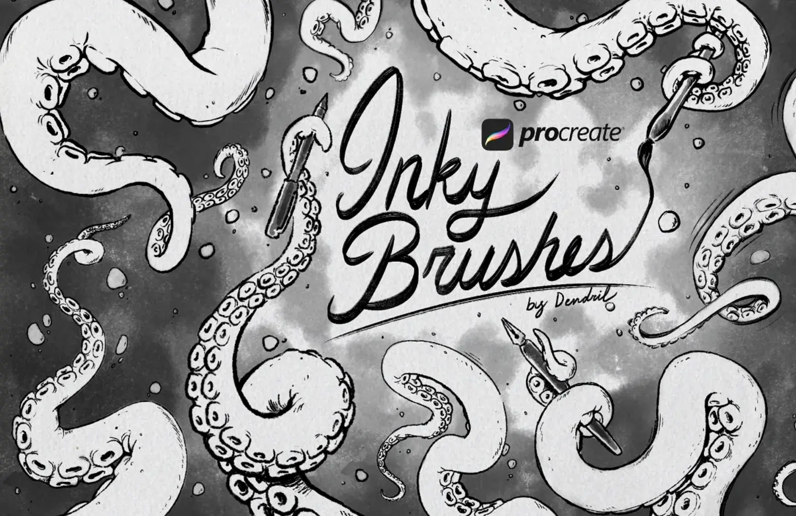
This collection of 17 brushes will have you covered for fountain, dip, and brush pens. Use for lettering, drawing, and calligraphy.
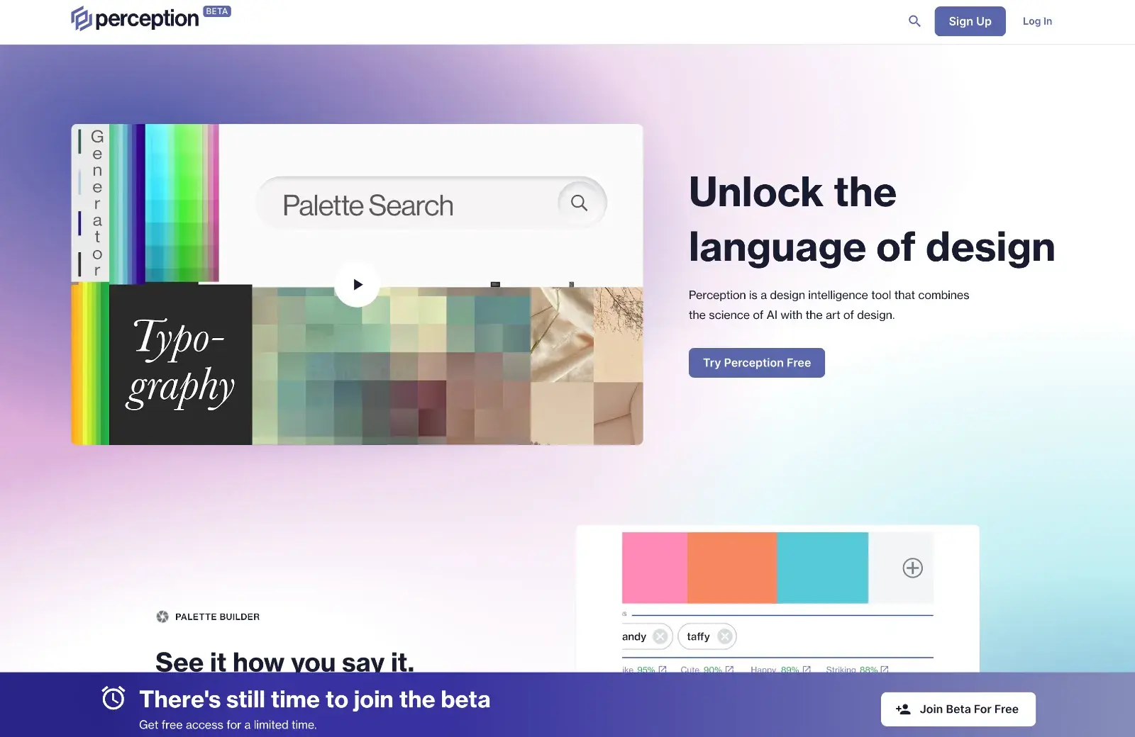
Perception is an AI-powered color palette generator that selects color schemes based on moods, styles, and trends. Currently in free beta.
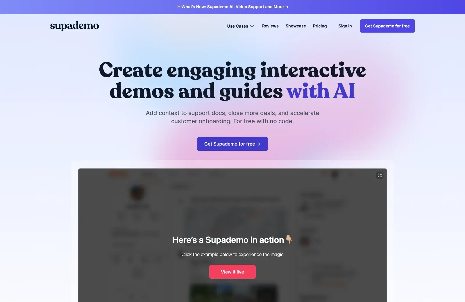
Supademo 2.0 has added AI personalization to its interactive demo platform, making the process of creating walkthroughs and demos even easier.
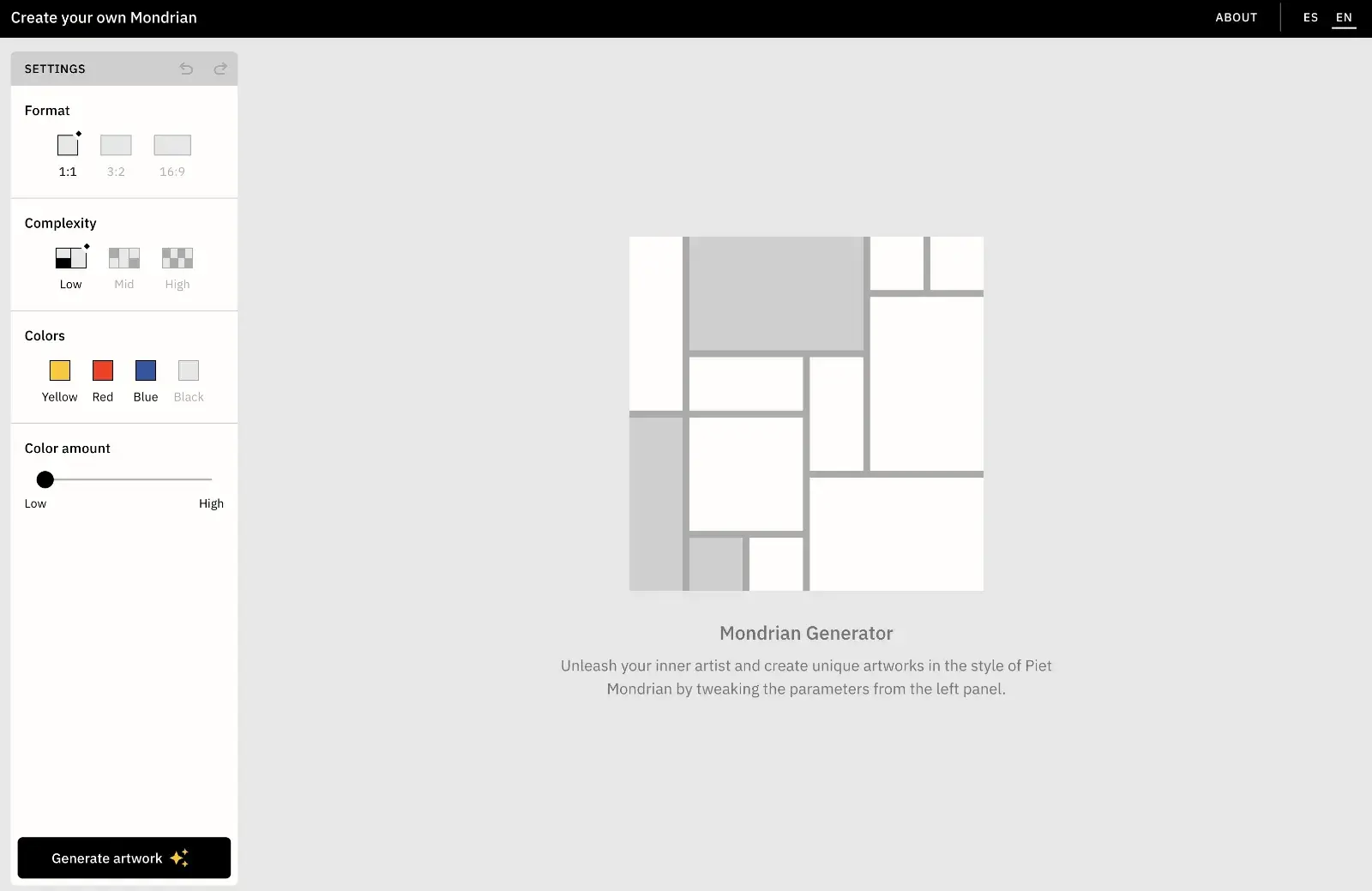
While possibly missing the point of what Piet Mondrian was doing in his paintings, this fun little app is good for sparking layout ideas.
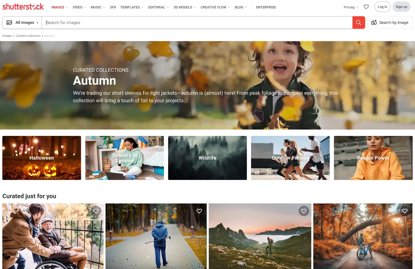
If you’re looking for seasonal images, this curated collection from Shutterstock is an ideal place to start.
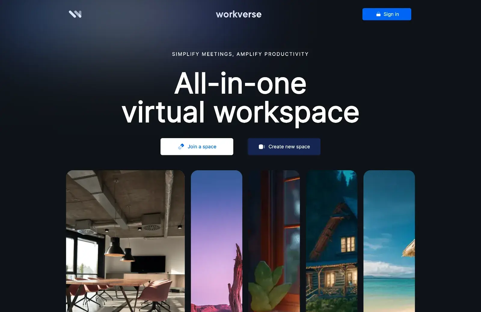
After its initial launch in June this year, the team behind Workverse listened to feedback from early adopters and has launched version 2 of this virtual, collaborative workspace, complete with AI assistant.
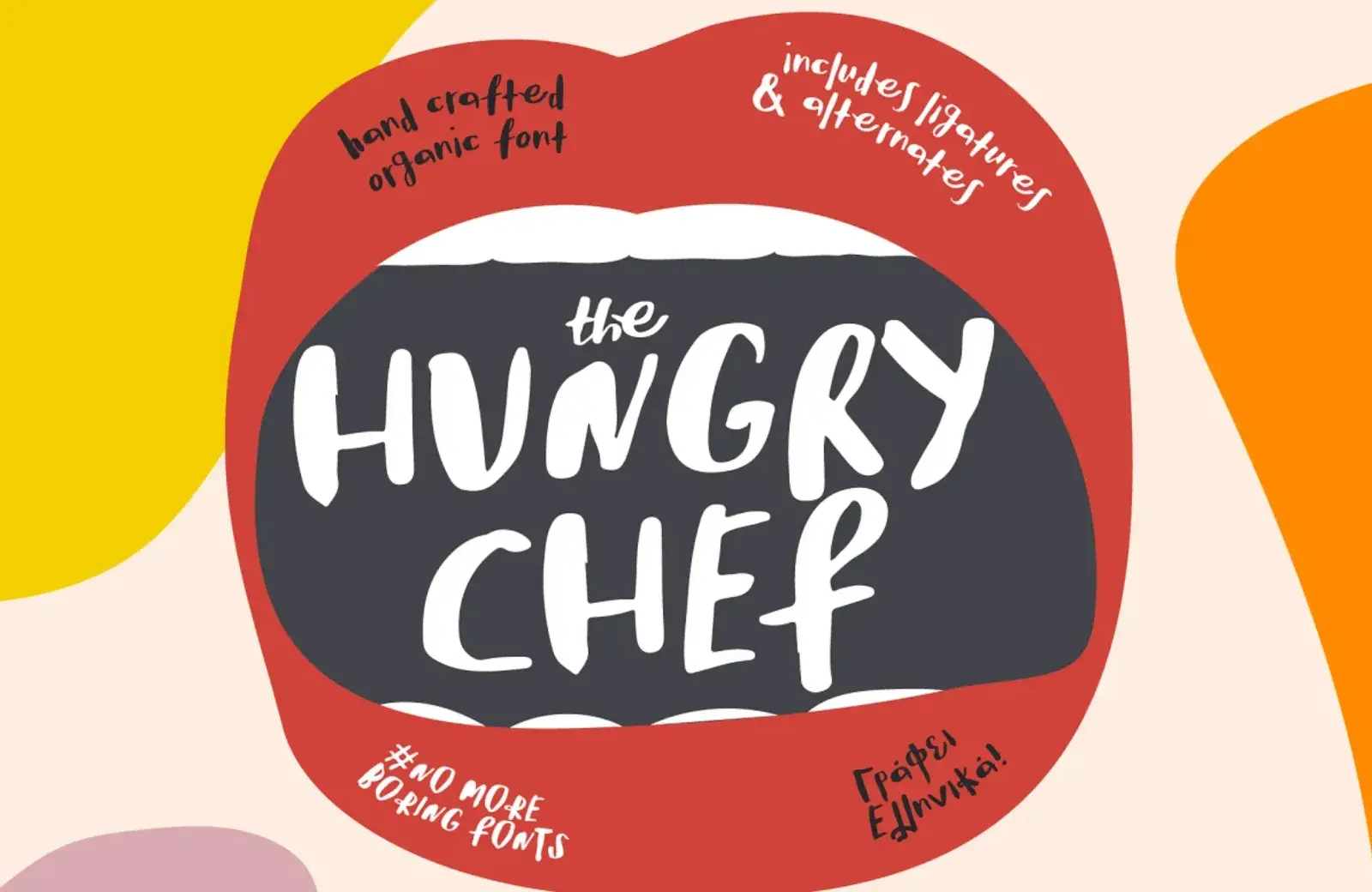
The Hungry Chef is a great expressive display font, chock full of character. As well as ligatures and alternatives, it includes a dedicated Greek alphabet.
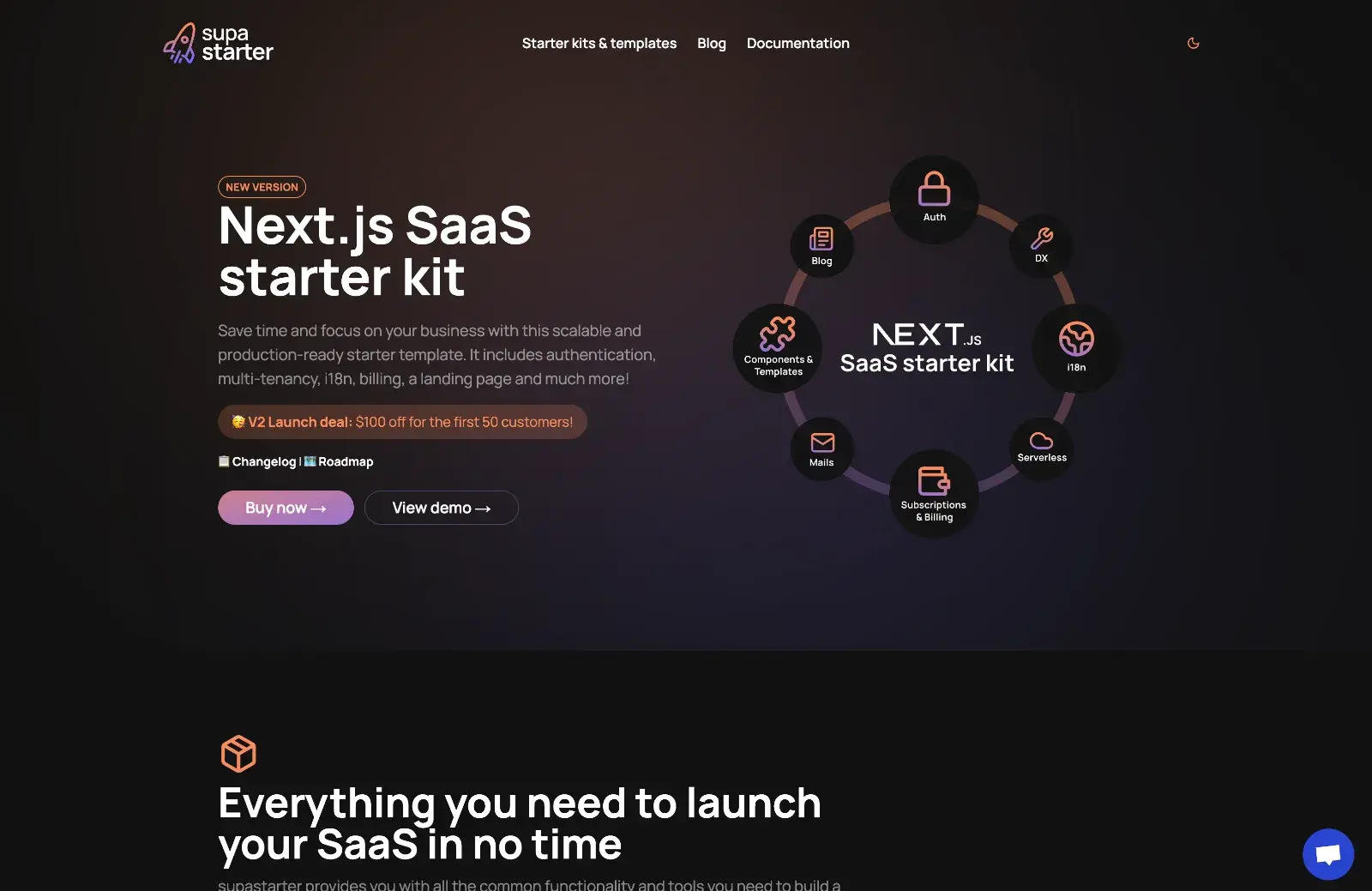
Supastarter makes starter kits and templates for creating SaaS apps. This one is with Next.js 13 and the new app router. There is a Nuxt kit coming soon.
Punkt is a UX writing and content design platform made by content designers for content designers. Early bird sign-up is open now.
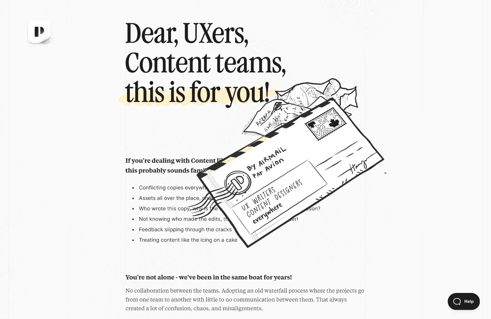
IndexGuru speeds up page indexing on search engines from what could be months to a matter of days. Features include a daily check for any unindexed pages, which are then automatically indexed.
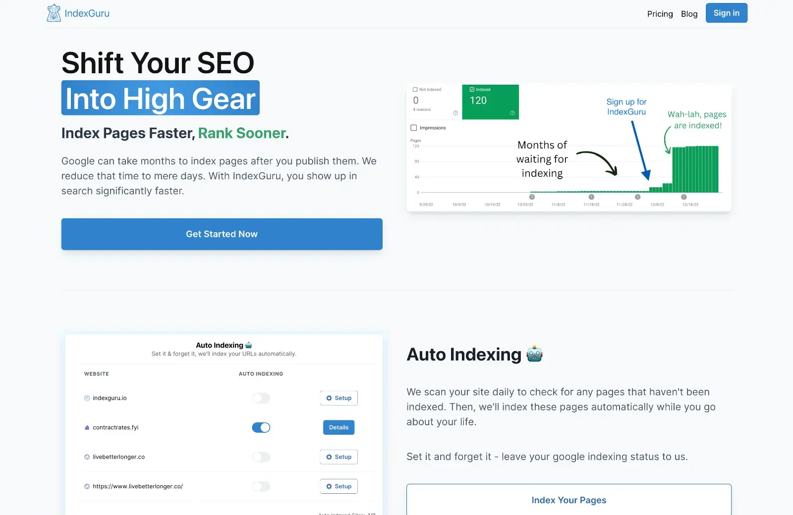
A new iPhone release means new mockups: helpfully, asset marketplace Craftwork has you covered with these iPhone 15 mockups for Figma.
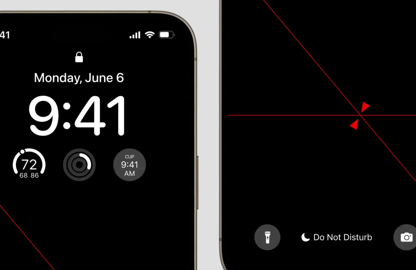
TinyAPI is an API marketplace currently accepting submissions from developers. Early access to the hub is available on request.
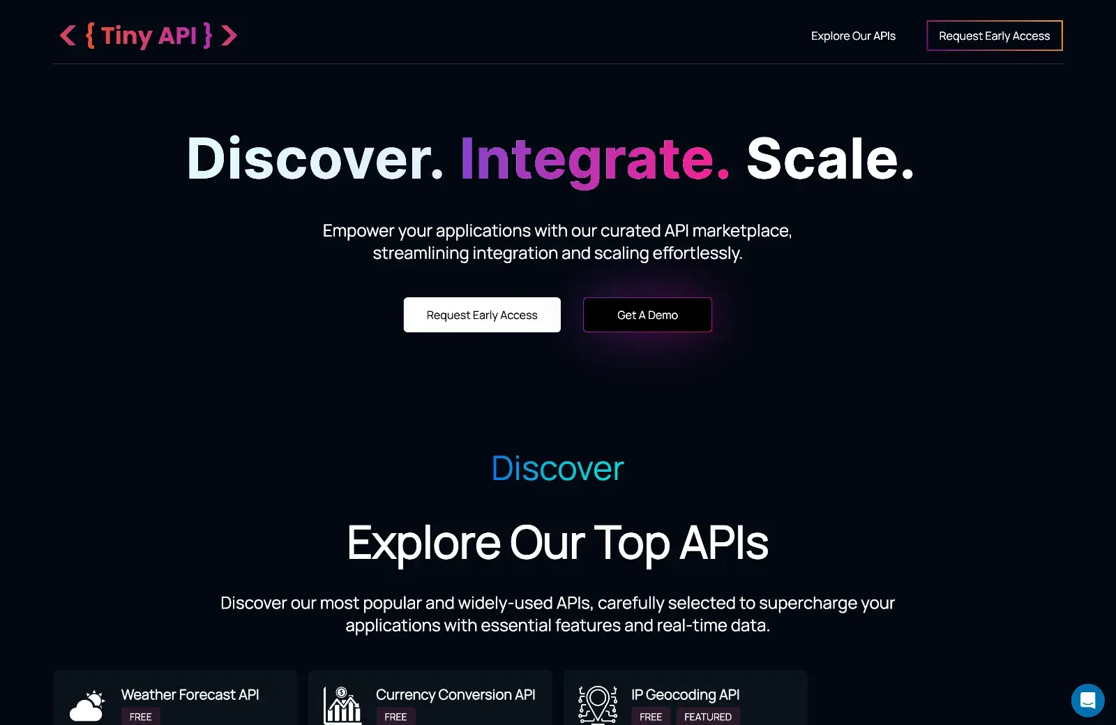
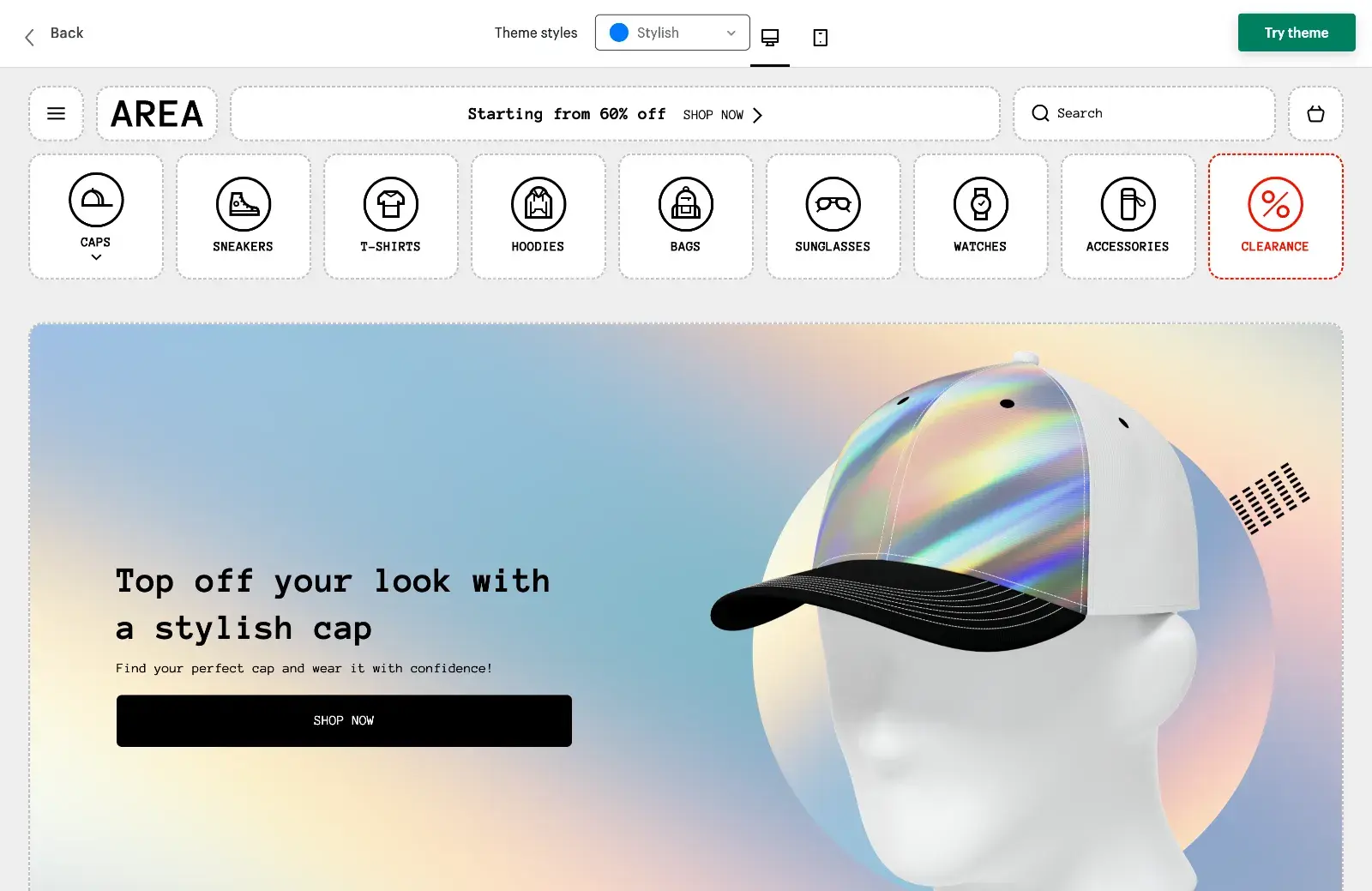
The Area theme for Shopify is designed for quick setup and is packed with features. It’s not cheap, but you get several style versions for the price of one.
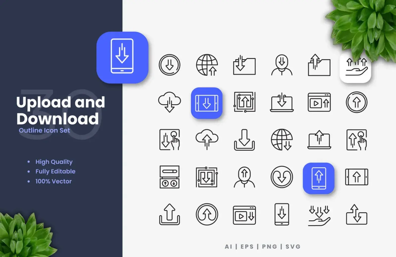
This is a nice set of 30 clean outline icons to indicate upload and download. Fully customizable vectors, the files include Ai, EPS, PNG, and SVG.
Paddi MacDonnell


Yesterday
We’re all familiar with rebrands going wrong, but what happens when they go right? From McDonald’s health kick to Burberry’s iconic turnaround, hold on to your hats as we explore the ten most successful rebrands of all time.
 Ah, company rebrands—the cornerstone of any business looking to save their skin after months of falling sales, PR nightmares, and poor public perceptions.
We’ve seen some terrible brand identity changes over the years (we’re looking at you, Gap). Fortunately, we’ve also witnessed some incredible rebrands that have altered public perception and catapulted companies back into the limelight. In this article, we’re going to cover the ten best of all time.
But, before we get into the list, we need to tackle a little point of contention. Let’s define what we mean when we talk about a ‘rebrand’.
What do we mean by a successful ‘rebrand’?
When most of us think of rebrands, we think of logo changes and name alterations. While these are often the hallmarks of a visual identity switch-up, they aren’t the only way a business can rebrand.
By definition, a rebrand is anything a company does to change its corporate image. How a company achieves this goal is less important than the end result.
Whether it’s a life-saving new logo, ingenious ad campaign, or strategic marketing ploy, as long as a company finds a way to hit the big red reset button and change public perception, it’s a rebrand.
Now that we’ve cleared that up, let’s get onto the list.
10) Dunkin’ – Wait, they sell more than just donuts?
 49.4vw, (min-width: 1020px) 55.8vw, (min-width: 1170px) 61.3vw, 94.5vw” width=”1600″ height=”1040″ loading=”lazy”><figcaption>Dunkin’ reminds everyone that they aren’t just a donut shop (Credit: Dunkin’)</figcaption></figure>
<p>When Dunkin’ dropped their donuts back in 2018, public reception was understandably mixed. Many couldn’t comprehend why one of America’s most popular fast-food chains needed to shorten its iconic name.</p>
<p dir=) Others, however, responded positively. Many understood that the business wanted to change its brand to remind consumers it wasn’t just a donut shop. After all, the company’s coffee and sandwich offerings were just as popular as its selection of sweet treats.
Others, however, responded positively. Many understood that the business wanted to change its brand to remind consumers it wasn’t just a donut shop. After all, the company’s coffee and sandwich offerings were just as popular as its selection of sweet treats.
The Dunkin’ rebrand was hugely successful. The attention the new name received, both good and bad, helped Dunkin’ to continue its strong growth trajectory. Plus, we’re sure they acquired at least a few extra customers who realized the company has more on offer than donuts. Win-win.
9) Instagram
 49.4vw, (min-width: 1020px) 55.8vw, (min-width: 1170px) 61.3vw, 94.5vw” width=”1600″ height=”1040″ loading=”lazy”><figcaption>Instagram’s logo change was shocking. But maybe that was the point? (Credit: Instagram)</figcaption></figure>
<p>When Instagram unveiled its new logo design back in 2016, the change sent the community into uproar. Most thought the rebrand was a terrible idea (oh, how the internet loves sudden changes). Many complained they couldn’t find the app on their phone anymore. Some even believed their device was under attack from malware because they didn’t recognize the new icon.</p>
<p dir=) Of course, Instagram had its reasons for the change. The social media site wanted to reflect the fact that Instagram was no longer a simple photo-sharing app but a world-leading platform with numerous features.
Of course, Instagram had its reasons for the change. The social media site wanted to reflect the fact that Instagram was no longer a simple photo-sharing app but a world-leading platform with numerous features.
Over time, consumers grew increasingly familiar with the new logo as their memories of the previous Polaroid camera icon slowly faded.
Instagram’s logo change was a success on two fronts. First, it was a necessary change to reflect the company’s shift to a more diverse social website. Second, whether you loved it or loathed it, Instagram’s rebrand got everyone talking. And, if there’s one thing we know about multibillion-dollar corporations, they absolutely love to be in the spotlight.
8) CVS –
 49.4vw, (min-width: 1020px) 55.8vw, (min-width: 1170px) 61.3vw, 94.5vw” width=”1600″ height=”1040″ loading=”lazy”><figcaption>CVS needed to drop the cigarettes if anyone was going to take their ‘health’ rebrand seriously. Credit: CVS)</figcaption></figure>
<p>Ah, the pharmacy – the perfect place to pick up your medication, buy essential toiletries, and get your nicotine fix for the day. Wait, what?</p>
<p dir=) Back in 2014, CVS became the first large-scale pharmacy chain in America to stop selling tobacco products. Sure, this may seem like a reasonably obvious rebranding for a pharmacy, but it’s important to note that cigarettes comprised 4% of the firm’s annual sales. This was the brand’s way of saying that some things are simply more important than profit (take notes, Bezos).
Back in 2014, CVS became the first large-scale pharmacy chain in America to stop selling tobacco products. Sure, this may seem like a reasonably obvious rebranding for a pharmacy, but it’s important to note that cigarettes comprised 4% of the firm’s annual sales. This was the brand’s way of saying that some things are simply more important than profit (take notes, Bezos).
In the process, CVS also changed its name from ‘CVS Caremark’ (whatever that means) to CVS Health. Perhaps this change was in the works for a long while but the company couldn’t risk putting ‘health’ into their branding while they still had cigarettes in their stores. I guess we’ll never know.
The rebranding was a strong statement and proved CVS’s commitment to creating a healthier America. The company’s revenue has grown at an annual rate of 10.8% ever since.
7) LEGO – Remembering the reason they were popular
 49.4vw, (min-width: 1020px) 55.8vw, (min-width: 1170px) 61.3vw, 94.5vw” width=”1600″ height=”1040″ loading=”lazy”><figcaption>Lego needed to go back to basics to fix their mistakes (Credit: LEGO)</figcaption></figure>
<p>Back in the early 1990s, LEGO was on top of the world. The company was going from strength to strength. Every kid wanted to try the toys, and most already had.</p>
<p dir=) Sadly, LEGO’s overconfidence was its downfall. The company began to rapidly expand into new markets in an attempt to diversify its offerings.
Sadly, LEGO’s overconfidence was its downfall. The company began to rapidly expand into new markets in an attempt to diversify its offerings.
Suddenly, LEGO wanted a slice of every pie in the market. The brand invested in video games, action figures, sports sets, comics, jewelry for kids, animated movies, books, and much, much more.
 49.4vw, (min-width: 1020px) 55.8vw, (min-width: 1170px) 61.3vw, 94.5vw” width=”1600″ height=”1040″ loading=”lazy”><figcaption>Sure, Bionicles were cool. But they didn’t allow the kids to build. Isn’t that what Lego is all about? (Credit: LEGO)</figcaption></figure>
<p>Through all of these investments, however, LEGO lost sight of the reason they were so popular in the first place – kids. And what do kids want from LEGO? The ability to build things themselves, of course (this seems obvious with the benefit of hindsight).</p>
<p dir=) In 2003, LEGO realized its expensive mistake. After reporting over $300,000,000 in losses, the company pledged to return to its roots, promptly scrapping its pre-built action figures in favor of good old-fashioned bricks.
In 2003, LEGO realized its expensive mistake. After reporting over $300,000,000 in losses, the company pledged to return to its roots, promptly scrapping its pre-built action figures in favor of good old-fashioned bricks.
All was right again in the world. Kids were encouraged to be creative once again, and LEGO once again ascended to become the world’s biggest toy company, proving that sometimes, less really is more.
6) Mcdonalds – Health epidemic to health-conscious
 49.4vw, (min-width: 1020px) 55.8vw, (min-width: 1170px) 61.3vw, 94.5vw” width=”1600″ height=”1040″ loading=”lazy”><figcaption>McDonald’s shakes off obesity crisis concerns with a timely health food rebrand (Credit: McDonalds)</figcaption></figure>
<p>Those of us who visited Mcdonald’s in the 1990s may have vivid memories of kitschy yellow interiors, hamburger seats, and McDonald’s brand ashtrays. Sadly, however, the fast food brand is more commonly known for its range of unhealthy food options than its unusually lavish interiors.</p>
<p dir=) Following the release of Morgan Spurlock’s 2004 documentary Super Size Me, in which the host attempted to live entirely on McDonald’s food for a month (with disastrous consequences), McDonald’s knew it had to act fast to fix its public image.
Following the release of Morgan Spurlock’s 2004 documentary Super Size Me, in which the host attempted to live entirely on McDonald’s food for a month (with disastrous consequences), McDonald’s knew it had to act fast to fix its public image.
The fast food giant immediately began its rebranding process. New healthy lunch items like wraps and salads were introduced. The opening of McCafe swapped McFlurry’s for herbal teas and coffees. The company even redesigned its locations to represent its new sophisticated approach to fast food. All in all, it felt like McDonald’s had matured from an unhealthy teenager into a health-conscious adult.
It goes without saying that the rebranding efforts were hugely successful. While Mcdonald’s is still fighting tooth and nail to clean up its public image, the company’s new health-conscious brand story has given the fast food chain the opportunity to prove it’s worth as more than a grab-and-go burger joint.
5) Stella Artois –
 49.4vw, (min-width: 1020px) 55.8vw, (min-width: 1170px) 61.3vw, 94.5vw” width=”1600″ height=”1040″ loading=”lazy”><figcaption>Stella offers a masterclass in ‘how to transform your cheap lager into a premium product’ (Credit: Stella Artois)</figcaption></figure>
<p>For decades, Stella Artois was synonymous with beer bellies, binge drinking, and British hooliganism. The lager stood nervously as the holy grail of lager louts worldwide.</p>
<p dir=) The brand’s motto of being ‘reassuringly expensive’ fell flat when supermarkets began offering the lager at a discounted rate. Any self-respecting drinker would stay well away from the beverage, and if they did choose to consume it, they’d likely ask for it in a non-branded glass to avoid awkward sideways glances from their peers.
The brand’s motto of being ‘reassuringly expensive’ fell flat when supermarkets began offering the lager at a discounted rate. Any self-respecting drinker would stay well away from the beverage, and if they did choose to consume it, they’d likely ask for it in a non-branded glass to avoid awkward sideways glances from their peers.
By 2010, Stella Artois knew that something needed to change. In collaboration with New York-based marketing agency Mother, the company embarked on a campaign to change the public perception of its disgraced brand. Mother began by conceiving a new slogan, She is a thing of beauty, in an attempt to position the brand as exotic and romantic. The new brand position was accompanied by a 9-step pour guide, with the aim of reminding consumers that Stella could be consumed in a glass as well as out of a can.
Consumers were convinced. “Surely a brand with a 9-step pour guide can’t be the favored beverage of violent binge drinkers?”, they thought. “In that case, this must be a lager for the sophisticated alcohol consumer”.
As if by magic, Stella was a premium product again. The company rapidly shed its ugly skin as the king of cheap lagers and quickly became a sought-after offering in pubs, bars, and restaurants throughout the UK.
4) Apple – It’s not an electronic. It’s a lifestyle
 49.4vw, (min-width: 1020px) 55.8vw, (min-width: 1170px) 61.3vw, 94.5vw” width=”1600″ height=”1040″ loading=”lazy”><figcaption>When Steve Jobs returned to Apple in 1997, he had a lot of work to do to save the brand (Credit: Apple)</figcaption></figure>
<p>Considering the universality of Apple’s products today, it may be surprising to learn the company was once on the brink of bankruptcy.</p>
<p dir=) Unlike many rebrands on this list, Apple’s change of fortune was not an overnight success story, nor was it the result of a single ad campaign. Instead, the tech company made a series of ingenious moves to make consumers perceive Apple not as an electronics company, but as a lifestyle brand.
Unlike many rebrands on this list, Apple’s change of fortune was not an overnight success story, nor was it the result of a single ad campaign. Instead, the tech company made a series of ingenious moves to make consumers perceive Apple not as an electronics company, but as a lifestyle brand.
Jobs knew that Apple’s strong suit lay in its ability to make new technology accessible to everyone, and he played into this strength expertly.
Suddenly, all of Apple’s products were no longer mere electronics. They were an extension of those who bought them – a component of the ideal lifestyle. With the help of sleek packaging and clever marketing campaigns, Jobs turned Apple’s products from cool tech items into must-have status symbols.
Steve Jobs’ ambitions worked out perfectly. Apple continued to grow steadily for almost a decade. Then, in 2007, they debuted the first iPhone. You already know the rest.
3) Old Spice – It turns out you can teach an old dog new tricks.
 49.4vw, (min-width: 1020px) 55.8vw, (min-width: 1170px) 61.3vw, 94.5vw” width=”1600″ height=”1040″ loading=”lazy”><figcaption>Old Spice turned its ‘old man’ product into a millennial bestseller. (Credit: Old Spice)</figcaption></figure>
<p>Old Spice released its first product all the way back in 1937. Unfortunately, the company’s status as an old-school icon did little to save it from an unfashionable reputation.</p>
<p dir=) For decades, Old Spice just couldn’t seem to shake the stereotype that it was a brand for older men. Even the 40-60-year-old demographic considered themselves too trendy to use the product range. And the younger generation? Forget about it. Expecting a teenager to wear Old Spice before a college class was like giving them VHS tapes to go to a Netflix party. Like a flip phone in a hipster coffee shop, it felt terribly outdated.
For decades, Old Spice just couldn’t seem to shake the stereotype that it was a brand for older men. Even the 40-60-year-old demographic considered themselves too trendy to use the product range. And the younger generation? Forget about it. Expecting a teenager to wear Old Spice before a college class was like giving them VHS tapes to go to a Netflix party. Like a flip phone in a hipster coffee shop, it felt terribly outdated.
In an attempt to appeal to younger demographics, Old Spice designed a series of tongue-in-cheek adverts that half-jokingly positioned the brand as the peak of masculinity.
The company fielded pop culture stars like LL Cool J, Isaiah Mustafa, and Brian Urlacher to sell the product in a series of commercials noted for their quirky humor, satire, and rapid shifts in tone.
 49.4vw, (min-width: 1020px) 55.8vw, (min-width: 1170px) 61.3vw, 94.5vw” width=”1600″ height=”1040″ loading=”lazy”><figcaption>‘The Man Your Man Could Smell Like’ campaign debuted at the SuperBowl in 2010 (Credit: Old Spice)</figcaption></figure>
<p>The ads were an immediate success. Some, such as the<em> ‘Man Your Man Could Smell Like</em>‘ campaign, went viral instantly. Just like that, the cobwebs were gone. Old Spice was cool again. Millennials resonated with the brand’s humorous new identity, and Old Spice gained a new lease of life. Sales skyrocketed by 125 percent by the end of the year. Ah, the power of great marketing.</p>
<h3 dir=) 2) Walmart – Save money (but not too much).
2) Walmart – Save money (but not too much).
 49.4vw, (min-width: 1020px) 55.8vw, (min-width: 1170px) 61.3vw, 94.5vw” width=”1600″ height=”1040″ loading=”lazy”><figcaption>Walmart shifted public perception from ‘cheap knock-off store’ to premium ‘supermarket’. (Credit: Walmart)</figcaption></figure>
<p>Walmart’s 2008 switch-up still stands as one of the most impactful rebrands of all time.</p>
<p dir=) For years, the retail chain was perceived as ‘the place you go to buy really cheap stuff’. The business was famed for its low prices, and when the store first opened in 1962, this was a big draw.
For years, the retail chain was perceived as ‘the place you go to buy really cheap stuff’. The business was famed for its low prices, and when the store first opened in 1962, this was a big draw.
Over time, however, consumers grew more sophisticated. People had more disposable income and wanted to use it on new, premium products. The company needed to diversify its business strategy if it hoped to keep up.
Walmart’s brand alterations began with a logo change. The organization also ditched its old ‘Always Low Prices’ slogan in favor of a slightly less savings-centric ‘Save Money. Live Better’. Walmart even launched new products and redesigned its stores to promote the grand overhaul.
As you’ve probably guessed, the rebrand was enormously successful. Sales skyrocketed as millions of consumers flocked to Walmart to see what all the fuss was about. The brand was quick to cement its spot as America’s number-one retail corporation.
The lesson? It’s okay to promise affordability, but go too cheap, and your consumers will assume your products are low-quality.
1) Burberry – from hooliganism to haute couture
 49.4vw, (min-width: 1020px) 55.8vw, (min-width: 1170px) 61.3vw, 94.5vw” width=”1600″ height=”1040″ loading=”lazy”><figcaption>Burberry tops our list as the company that underwent the biggest change in brand positioning (Credit: Burberry)</figcaption></figure>
<p>When famous British pop and garage artists began donning Burberry clothing back in the early 2000s, the brand hoped the endorsements would be their ticket to appealing to the younger generation.</p>
<p dir=) Sadly, Burberry got more than they bargained for when their trademark check pattern became the hallmark of British hooliganism and lawlessness.
Sadly, Burberry got more than they bargained for when their trademark check pattern became the hallmark of British hooliganism and lawlessness.
The situation grew so dire that some pubs and bars wouldn’t allow anyone wearing the brand to enter their premises. Even the most upstanding of citizens spotted wearing a checkered Burberry coat and hat combo would be offered a suitably wide berth on the high street. It all became a little bit manic.
Fast forward to 2009. Enter global megastar, Emma Watson. The leading actress was at the height of her Harry Potter fame when Burberry creative director Christopher Bailey approached her to be the face of the brand. Evidently not fearing the possibility of being labeled a hooligan, Watson accepted.
In the actress’s most incredible display of magic since her role as Hermione Granger, Emma Watson cast a forgetfulness charm on the entire nation, turning Burberry from a hooligan hallmark to a desirable fashion brand in a single iconic photoshoot.
 49.4vw, (min-width: 1020px) 55.8vw, (min-width: 1170px) 61.3vw, 94.5vw” width=”1600″ height=”1040″ loading=”lazy”><figcaption>Emma Watson casts a spell, turning Burberry from hooligan hallmark to catwalk craze overnight (Credit: Burberry) </figcaption></figure>
<p>Suddenly, Burberry was all the rage again. The rebranding campaign catapulted the organization back into the limelight. Sales increased by 23% to £215m by the end of 2009, with Burberry’s new identity allowing it to gain a stronger foothold in the US market.</p>
<h3 dir=) Shutting up shop
Shutting up shop
What lessons can we learn from this list? There are too many to count. Wait for the right time to rebrand. A controversial change isn’t necessarily a bad one. Don’t lose sight of the core values that your consumers know you for. Remain adaptable. And, if all else fails, pay for Emma Watson to do a photoshoot with your product. Simple!
Did you agree with our ranking list? Did we miss something? Tweet at us and let us know your thoughts.
Max Walton
Born in Cardiff Wales, Max relocated to Brisbane when he was 12. He’s spent the last five years developing expertise in the Fintech industry. When he’s not posting about Web3, you’ll find him on a paddleboard.


4 days ago
Every now and then, website design trends can leave you scratching your head. This month’s collection includes some of those.

Carrie Cousins


5 days ago
Every Sunday, we round up the best stories from webdesignernews.com. This issue features UX principles to improve your sites and apps, typography trends, a social rebrand, the best logos from the 1960s, and AI news. Plus, tons more! Let’s dive in!

Louise North
Louise is a staff writer for WebdesignerDepot. She lives in Colorado, is a mom to two dogs, and when she’s not writing she likes hiking and volunteering.

September 15, 2023
When you hire graphic designers to create your company’s logo, what do you expect? Professional designs, culturally sensitive icons, creativity, and originality don’t sound like too big an ask. Unfortunately, these brands got more than they bargained for.
 From graphic designer oversights and unprompted rebrands to conspiracy theories and racial overtones, we’ve seen a lot of weird, wacky, and downright disastrous logos in recent times. In this ranking, we’re going to condense down eight of the most controversial. Let’s get into the list.
20) Junior Jazz Dance Classes – Once you see it…
 49.4vw, (min-width: 1020px) 55.8vw, (min-width: 1170px) 61.3vw, 94.5vw” width=”1600″ height=”1040″ loading=”lazy”><figcaption> This school of dance is offering more than Jazz lessons (Credit: Junior Jazz Dance Classes)</figcaption></figure>
<p dir=) This infamous ad is one of the few on this list that came from a relatively unknown brand, but it’s simply too hilarious not to include.
This infamous ad is one of the few on this list that came from a relatively unknown brand, but it’s simply too hilarious not to include.
If you’re one of the lucky ones who see a pair of high-spirited jazz enthusiasts performing a lively dance, we envy you. Inspect this logo closely, however, and you may just see something else entirely. Don’t believe me? Focus on the white space between the dancers. Once you see it, you’ll struggle to look away.
If there were a dictionary definition for design tunnel vision, this would be the accompanying illustration. The only reason this isn’t ranked higher is that Junior Jazz Dance Classes are small-scale compared to many of the other disastrous rebrands on this list.
Ah, well, at least this logo likely secured them some publicity. For better or for worse, it’ll be burned into our memories forever.
19) Arlington Pediatric Center – No elaboration needed
 49.4vw, (min-width: 1020px) 55.8vw, (min-width: 1170px) 61.3vw, 94.5vw” width=”1600″ height=”1040″ loading=”lazy”><figcaption> Would you visit the Arlington Pediatric Center for a routine exam? (Credit: Arlington Pediatric Center)</figcaption></figure>
<p>Okay, I’m taking it all back. Earlier, I said that Junior Jazz Dance Classes’ rebrand was the ultimate example of design tunnel vision. Now, I’m recanting that statement.</p>
<p dir=) When Arlington Pediatric Center displayed their new logo on public signage back in 2009, it didn’t take long for commuters to point out that their ‘family-friendly’ icon could be taken the wrong way.
When Arlington Pediatric Center displayed their new logo on public signage back in 2009, it didn’t take long for commuters to point out that their ‘family-friendly’ icon could be taken the wrong way.
There’s no information about whether the company still uses the logo today, but considering every Google search of ‘Arlington Pediatric Center’ immediately leads you to images of the logo, I’m not sure a rebrand could save them.
18) The Institute of Oriental Studies – Seriously?
 49.4vw, (min-width: 1020px) 55.8vw, (min-width: 1170px) 61.3vw, 94.5vw” width=”1600″ height=”1040″ loading=”lazy”><figcaption> Does this one really need a caption? (Credit: The Institute of Oriental Studies)</figcaption></figure>
<p>Here we go again.</p>
<p dir=) This one is meant to be a pagoda in front of the sun, but most users see something entirely different. Need I say more?
This one is meant to be a pagoda in front of the sun, but most users see something entirely different. Need I say more?
The Brazilian University of Santa Catarina quickly realized its mistake and axed the logo before suffering any further ridicule.
17) Office of Government Commerce – Please make it stop
 49.4vw, (min-width: 1020px) 55.8vw, (min-width: 1170px) 61.3vw, 94.5vw” width=”1600″ height=”1040″ loading=”lazy”><figcaption>The Office of Government Commerce has a firm grip on the economy (Credit: OGC)</figcaption></figure>
<p>The UK’s Office of Government Commerce spent over £14,000 on its grand logo redesign back in 2008. Consumers were quick to point out its shortcomings.</p>
<p dir=) The rebrand looks fine when viewed at the normal angle, but rotate the logo 90 degrees, and it’s an entirely different story. Add this one to the ‘unintendedly sexual’ category of terrible logos.
The rebrand looks fine when viewed at the normal angle, but rotate the logo 90 degrees, and it’s an entirely different story. Add this one to the ‘unintendedly sexual’ category of terrible logos.
The government body stood by its new look, arguing that, while the logo could be misinterpreted, it is not inappropriate for an organization “looking to have a firm grip on Government spend”. Interpret that as you wish.
The OGC was closed in 2011. Sadly, their newfound hands-on approach to leadership did little to save them from budget cuts.
16) Hillary Clinton – Hospital: First exit on your right
 49.4vw, (min-width: 1020px) 55.8vw, (min-width: 1170px) 61.3vw, 94.5vw” width=”1600″ height=”1040″ loading=”lazy”><figcaption>Hillary makes a move in the right direction (Credit: Hillary for America)</figcaption></figure>
<p>Hillary Clinton’s 2015 campaign logo was supposed to symbolize progress. Sadly, internet users didn’t see it that way.</p>
<p dir=) Some suggested the ‘red arrow’ logo was a veiled announcement that Clinton was making an unprecedented shift to the political right wing. Others simply thought it looked like directions to a nearby hospital.
Some suggested the ‘red arrow’ logo was a veiled announcement that Clinton was making an unprecedented shift to the political right wing. Others simply thought it looked like directions to a nearby hospital.
Either way, the logo didn’t do Hillary any favors, with most agreeing the design was anything but inspiring.
15) University of California – Logo design pending
 49.4vw, (min-width: 1020px) 55.8vw, (min-width: 1170px) 61.3vw, 94.5vw” width=”1600″ height=”1040″ loading=”lazy”><figcaption>The new logo (pictured left) really captures what makes the University of California unique (Credit: UoC)</figcaption></figure>
<p>The University of California unveiled its new look logo in 2012. Sadly, this one didn’t receive top marks.</p>
<p dir=) Whether you think it looks like a toilet seat or a loading icon (perhaps the real logo simply hasn’t loaded in yet), there’s no denying this redesign is abysmal.
Whether you think it looks like a toilet seat or a loading icon (perhaps the real logo simply hasn’t loaded in yet), there’s no denying this redesign is abysmal.
Admittedly, this logo was only meant for communications materials, meaning it was never actually set to replace the trademark seal. Regardless, it was much too late. The university was embarrassed, and the logo was promptly axed.
14) BP – An oil titan goes ‘green’
 49.4vw, (min-width: 1020px) 55.8vw, (min-width: 1170px) 61.3vw, 94.5vw” width=”1600″ height=”1040″ loading=”lazy”><figcaption>A logo doesn’t make you any more eco-friendly, BP (Credit: British Petroleum)</figcaption></figure>
<p>When British Petroleum spent $200 million on its rebrand back in 2000, consumers could barely conceal their laughter.</p>
<p dir=) The redesign was part of the oil company’s efforts to appear as an eco-conscious brand. But it would take more than a trendy new sun-shaped logo to pull the wool over anyone’s eyes.
The redesign was part of the oil company’s efforts to appear as an eco-conscious brand. But it would take more than a trendy new sun-shaped logo to pull the wool over anyone’s eyes.
BP’s history of horrendous climate disasters is well-storied. From disastrous oil spills to fossil fuel fiascos, the oil giant has been doing its bit to make climate reversal as challenging as possible for over a century. Way to go!
With this in mind, it seemed almost fate that their new ‘green’ logo would come back to bite them. And it did, with thousands creating parodies to mock the brand’s efforts. Lousy luck, BP.
13) Corsair – Gaming logo or regrettable tattoo?
 49.4vw, (min-width: 1020px) 55.8vw, (min-width: 1170px) 61.3vw, 94.5vw” width=”1600″ height=”1040″ loading=”lazy”><figcaption>Corsair creates a logo that looks like a tattoo (Credit: Corsair)</figcaption></figure>
<p>Gaming brand Corsair released its new logo to the public in 2014, removing the well-liked six flags icon in the process.</p>
<p dir=) The company’s grand new idea featured two curved scimitars joined at the hilt. Unfortunately, most users thought the redesign looked more like a tattoo than a pair of interlocked swords.
The company’s grand new idea featured two curved scimitars joined at the hilt. Unfortunately, most users thought the redesign looked more like a tattoo than a pair of interlocked swords.
Understandably, Corsair didn’t publicly acknowledge that the logo closely resembled a female lower back tattoo. They did, however, quietly discontinue the design in 2016.
12) The Premier League – Users roar about axed lion
 49.4vw, (min-width: 1020px) 55.8vw, (min-width: 1170px) 61.3vw, 94.5vw” width=”1600″ height=”1040″ loading=”lazy”><figcaption>Sorry, Premier League. We might have got this one wrong (Credit: The Premier League)</figcaption></figure>
<p>Okay, I admit. This is the only redesign on this list that didn’t actually happen. But the controversy was genuine.</p>
<p dir=) The Premier League’s iconic lion has been the brand’s much-loved mascot since 1992. Naturally, when passionate fans learned that the league planned to kill the nation’s favorite feline, they responded with furious anger.
The Premier League’s iconic lion has been the brand’s much-loved mascot since 1992. Naturally, when passionate fans learned that the league planned to kill the nation’s favorite feline, they responded with furious anger.
Of course, everyone was wrong. The league unveiled its rebrand, and the lion remained front and center. It turns out the ‘news’ was fake all along. Oops. Terribly sorry about the bad publicity. Can I still get a season ticket for next year?
11) BT – Logo oversimplification at its worst
 49.4vw, (min-width: 1020px) 55.8vw, (min-width: 1170px) 61.3vw, 94.5vw” width=”1600″ height=”1040″ loading=”lazy”><figcaption>And the award for ‘least inspired redesign of the decade’ goes to… (Credit: BT)</figcaption></figure>
<p>After years of development and countless delays, BT finally unveiled its monumental new logo back in 2019.</p>
<p dir=) The result? A circle with the letters’ BT’ written inside—all one color. Generic, much?
The result? A circle with the letters’ BT’ written inside—all one color. Generic, much?
Fans understandably mocked the rebrand, which replaced BT’s colorful globe icon.
But let’s take a different stance. Perhaps BT was actually an innovator, paving the way for inspiring brands like Elon Musk’s ‘X’ to hop on the one-color logo bandwagon.
Okay, probably not. But we’re trying to find some sort of silver lining here.
10) P&G – Bring out the tinfoil hats
 49.4vw, (min-width: 1020px) 55.8vw, (min-width: 1170px) 61.3vw, 94.5vw” width=”1600″ height=”1040″ loading=”lazy”><figcaption>P&G fuels the Satanic Panic with their hugely controversial ‘Satan’ logo.</figcaption></figure>
<p>What would a list of controversial logos be without a healthy dose of conspiracy?</p>
<p dir=) Proctor and Gamble were ruthlessly attacked for years over their logo design, with some arguing that the image contained references to the Devil.
Proctor and Gamble were ruthlessly attacked for years over their logo design, with some arguing that the image contained references to the Devil.
Conspirators pointed out what appeared to be an inverted ‘666’ in the beard of the company’s mascot. They also argued that the devil’s horns were visible at the upper and lower edges of the design.
I’m not one to point fingers, especially when it comes to the Antichrist, but this one seems a little tenuous.
Even so, P&G eventually removed the logo in 1991 amidst the Satanic Panic, replacing it with a much harder to misinterpret typographic logo. Phew. Better luck next time, Satan.
9) eBay – From 90s playfulness to corporate bore
 49.4vw, (min-width: 1020px) 55.8vw, (min-width: 1170px) 61.3vw, 94.5vw” width=”1600″ height=”1040″ loading=”lazy”><figcaption>How to suck the fun out of a website in one simple step (Credit: eBay)</figcaption></figure>
<p>When eBay gained popularity in the late 90s, part of the website’s appeal was its rough-around-the-edges aesthetic. This was a consumer-driven marketplace, after all. Using the auction felt fun, if a little wild west, and the logo at the time was the ideal advocate for this.</p>
<p dir=) eBay’s rebrand in 2012 introduced a new, slimmer version of the logo, turning what was once a playful reflection of 90s culture into a corporate trademark. The redesign was a painful reminder to early internet users that the fun days of the web were well and truly behind them.
eBay’s rebrand in 2012 introduced a new, slimmer version of the logo, turning what was once a playful reflection of 90s culture into a corporate trademark. The redesign was a painful reminder to early internet users that the fun days of the web were well and truly behind them.
Hey, at least they didn’t take notes from BT. An all-black eBay logo would be a terrible idea, right? That said, it has been eleven years since the site’s last rebrand. Never say never.
8) Dirty Bird – They knew what they were doing
 49.4vw, (min-width: 1020px) 55.8vw, (min-width: 1170px) 61.3vw, 94.5vw” width=”1600″ height=”1040″ loading=”lazy”><figcaption>Dirty Bird knew what they were doing when designing this mascot (Credit: DirtyBird)</figcaption></figure>
<p>Dirty Bird’s catering company delivers food and beverages to music festivals in Wales. Unfortunately, the quality of the company’s refreshments is entirely overshadowed by their hilariously phallic logo.</p>
<p dir=) The food van claims the logo is just a clever way to link together the ‘d’ and ‘b’ initials of the business name, with the two conveniently placed loops forming the feathery wings.
The food van claims the logo is just a clever way to link together the ‘d’ and ‘b’ initials of the business name, with the two conveniently placed loops forming the feathery wings.
Naturally, consumers aren’t convinced, with many saying the logo is pornographic and absolutely not what you want to think about before you tuck into some delicious fried chicken. Controversy aside, props to Dirty Bird for keeping up the gag. Even today, the ‘rooster’ icon still stands tall as the company’s cocksure mascot.
7) Starbucks – Because you don’t need a name to be recognizable
 49.4vw, (min-width: 1020px) 55.8vw, (min-width: 1170px) 61.3vw, 94.5vw” width=”1600″ height=”1040″ loading=”lazy”><figcaption>Starbucks do away with their trademark logo in favor of an oversimplified siren (Credit: Starbucks)</figcaption></figure>
<p>When Starbucks realized how recognizable its brand had become by 2011, it unveiled a massive logo redesign, removing many of the elements consumers had grown to know and love.</p>
<p dir=) The ‘Starbucks’ name was dropped, and the iconic siren was brought to the forefront. The logo shed its black highlights in favor of a simplified green and white duotone. Starbucks loyalists were incredibly frustrated, with many taking to Facebook to express how much they hated the new look.
The ‘Starbucks’ name was dropped, and the iconic siren was brought to the forefront. The logo shed its black highlights in favor of a simplified green and white duotone. Starbucks loyalists were incredibly frustrated, with many taking to Facebook to express how much they hated the new look.
Starbucks refused to cave under consumer pressure. The coffee giant still proudly stands behind its simplified siren today.
6) IHOP – Smiling face or mascot on the brink of insanity?
 49.4vw, (min-width: 1020px) 55.8vw, (min-width: 1170px) 61.3vw, 94.5vw” width=”1600″ height=”1040″ loading=”lazy”><figcaption>The new IHOP logo (left). Happy, or creepy? (Credit: IHOP)</figcaption></figure>
<p>In 2015, IHOP changed its logo for the first time in over 20 years, introducing a strange red curve underneath the ‘o’ and ‘p’.</p>
<p dir=) The new look logo was intended to resemble a smile, perhaps representing a consumer’s unshakeable happiness when biting into a stack of Original Buttermilk Pancakes.
The new look logo was intended to resemble a smile, perhaps representing a consumer’s unshakeable happiness when biting into a stack of Original Buttermilk Pancakes.
Sadly, however, fans didn’t see it that way. Aside from being another example of unnecessary logo simplification, many remarked that the new icon more closely resembled a clown smiling through the pain than a happy consumer tucking into an IHOP lunch.
Sadly, the line made by the ‘p’ makes the mascot look like shedding a solitary tear. Perhaps this is exactly how IHOP’s graphic design team reacted when reading the horrendous reviews of their rebrand. Ouch.
5) Airbnb – It’s a sexual organ… It’s Peter Griffin’s chin… It’s Airbnb’s new logo!
 49.4vw, (min-width: 1020px) 55.8vw, (min-width: 1170px) 61.3vw, 94.5vw” width=”1600″ height=”1040″ loading=”lazy”><figcaption>Users can’t make up their minds about Airbnb’s strange new logo (Credit: Airbnb)</figcaption></figure>
<p>This Airbnb logo took some serious heat from the public when it was released back in 2014, so much so that a Tumblr webpage was set up with the specific goal of mocking the disastrous redesign.</p>
<p dir=) The insults were wide-ranging and diverse. Some users claimed the logo was a ripoff of Automation Anywhere’s logo. One Twitter user claimed the logo was an amazing feat of “how to resemble as many sexual organs at once as possible”. Some uniquely creative members of the design community even Photoshopped the new logo onto Peter Griffin’s iconic butt-chin.
The insults were wide-ranging and diverse. Some users claimed the logo was a ripoff of Automation Anywhere’s logo. One Twitter user claimed the logo was an amazing feat of “how to resemble as many sexual organs at once as possible”. Some uniquely creative members of the design community even Photoshopped the new logo onto Peter Griffin’s iconic butt-chin.
Despite the backlash, Airbnb stuck by its logo, announcing that the company was prepared for the social media response and that controversy wasn’t new to them. They still use the logo to this day.
4) London 2012 – This one isn’t taking home the gold
 49.4vw, (min-width: 1020px) 55.8vw, (min-width: 1170px) 61.3vw, 94.5vw” width=”1600″ height=”1040″ loading=”lazy”><figcaption>London 2012 win a gold star for ‘too simple’ yet ‘too abstract’ (Credit: London 2012)</figcaption></figure>
<p>When Wolff Olins unveiled its $400,000 Olympic logo in 2007, it didn’t take long for the negative reviews to roll in.</p>
<p dir=) Many conspired that the logo was laden with hidden messages. Some claimed it resembled a swastika. Others labeled it as sexually suggestive (let’s hope they weren’t regulars at Arlington Pediatric Center).
Many conspired that the logo was laden with hidden messages. Some claimed it resembled a swastika. Others labeled it as sexually suggestive (let’s hope they weren’t regulars at Arlington Pediatric Center).
Iran even threatened to boycott the Olympics, claiming the logo was a thinly-veiled pro-Israeli conspiracy because it spelled the word ‘Zion’, which, incidentally, looks somewhat similar to ‘2012’ when you rotate certain letters and stretch your imagination to its limits.
Naturally, the Olympic Committee stuck to their guns (you’d hope this were the case after the $400k price tag). And, as the Olympics finally rolled around in 2012, it seems most had forgotten about the cataclysmic logo unveiling just five years prior. I’m certain Wolff Olins’ design team breathed a collective sigh of relief.
3) Aunt Jemima – When small changes aren’t good enough
 49.4vw, (min-width: 1020px) 55.8vw, (min-width: 1170px) 61.3vw, 94.5vw” width=”1600″ height=”1040″ loading=”lazy”><figcaption>Aunt Jemima’s controversial logo was founded on a racial stereotype (Credit: The Pearl Miller Company)</figcaption></figure>
<p>Missouri newspaper editor Chris L. Rutt unveiled his self-rising flour brand back in the late 1800s, naming his product after “Aunt Jemima”, a ballad performed by minstrel songwriters.</p>
<p dir=) Over the years, the brand’s identity became synonymous with the racist “mammy” stereotype, a caricature that depicts black female slaves as cheerful housekeepers for white families.
Over the years, the brand’s identity became synonymous with the racist “mammy” stereotype, a caricature that depicts black female slaves as cheerful housekeepers for white families.
Quaker Oats, the owner of the brand, made dozens of changes to the logo over the years in an attempt to lessen the controversy surrounding the logo. But nothing could detract from the fact that the company was founded on racial stereotypes.
Following decades of controversy, the Aunt Jemima brand was renamed to Pearl Milling Company back in 2021. Rejoice!
2) Gap – A lesson in unnecessary changes
 49.4vw, (min-width: 1020px) 55.8vw, (min-width: 1170px) 61.3vw, 94.5vw” width=”1600″ height=”1040″ loading=”lazy”><figcaption>Gap spots a gap in the market and misses by a country mile (Credit: Gap)</figcaption></figure>
<p>When US clothing retailer Gap introduced its new million-dollar logo design back in 2010, the world was quick to remind them why unprompted, soulless company changes are poor business etiquette.</p>
<p dir=) The new look Gap logo did away with the company’s iconic blue box in favor of an all-black font and strange bright blue gradient square next to the ‘p’. It all looked very vanilla, made infinitely worse by the questionable ‘Helvetica’ typeface, which doesn’t exactly scream ‘young target demographic’.
The new look Gap logo did away with the company’s iconic blue box in favor of an all-black font and strange bright blue gradient square next to the ‘p’. It all looked very vanilla, made infinitely worse by the questionable ‘Helvetica’ typeface, which doesn’t exactly scream ‘young target demographic’.
Thousands of users flocked to social media to tear the disastrous logo apart. Unsurprisingly, Gap quickly reversed the change. The new look logo lasted a grand total of six days before resigning. Gap CEO Marka Hansen promptly followed suit, leaving the company just four months later.
1) Cleveland Indians – Chief Wa-how could this one not take the top spot?
 49.4vw, (min-width: 1020px) 55.8vw, (min-width: 1170px) 61.3vw, 94.5vw” width=”1600″ height=”1040″ loading=”lazy”><figcaption>Could it really have been any other logo? Credit: Cleveland Guardians</figcaption></figure>
<p dir=) Beating out the competition by a narrow margin, the Cleveland Indians’ Chief Wahoo logo takes first prize.
Beating out the competition by a narrow margin, the Cleveland Indians’ Chief Wahoo logo takes first prize.
Advocates have spoken out against the mascot for decades, arguing that the logo depicts an offensive caricature of a Native American character and, therefore, contributes to the mockery of American Indians.
Supporters of the Mascot, however, retorted that the character is simply a cartoon and not intended to offend anyone.
The Cleveland Indians eventually removed the logo design from all of their branding, changing their name to the Cleveland Guardians in the process.
Whether you’re for or against it, it’s undeniable the old Cleveland Indians logo was divisive. The fact that over 50 US senators and President Barack Obama voiced their support for the brand change tells the whole story. This logo has rightfully earned its place at the top of our list. It may just be the most controversial logo of all time.
Robert Reeve
Robert is an experienced marketing professional with extensive experience working with brands to refine go-to-market plans, SEO campaigns, and content marketing strategies. A committed writer with a keen eye on the latest developments, Robert specialises in producing content across all things tech and marketing.
BEST WEB DESIGN TOOLS
- Mobirise Web Hosting $2
- Website Speed Test Tools
- Powerful SEO Tools
- Make Money with MobiMarket
- Web Design Graphic Resources
- Best Mobirise Tutorials Library
- Mobirise Tips and Tricks


Sold and fulfilled by Paddle – an authorized reseller.
Our order process is conducted by our online reseller Paddle.com. Paddle.com is the Merchant of Record for all our orders. Paddle provides all customer service inquiries and handles returns.
Disclaimer: This site (mobimarket) does not affiliate with Mobirise.com or their associated extensions, themes, etc. All logo, brandings, photos are copyrighted & belongs to their respective owners. All plugins, extensions and files displayed in the store was developed either by members of Mobirise fan or external developers, fees & donation paid will be used for the team to continue their development & contribution and also to maintain this site. Please check our FAQs for more info.