The late 90s were a time of excitement and apprehension, with the Y2K bug scare and popular TV shows like “Friends,” “The X‑Files,” and “Buffy the Vampire Slayer.” Musically, Britney Spears, Destiny’s Child, and the Spice Girls dominated the charts, drawing inspiration from clubs that played Techno and Drum & Base music.
The most transformative change was the World Wide Web, rapidly becoming a household staple and a space of endless possibilities. The iMac was the must-have technology. The dot-com boom was in full swing, and startups were growing rapidly, characterized by flashy graphics, neon colors, and simple animation that encapsulated the Y2K aesthetic.
For the first time in decades, youth culture was driving business as well as pop culture, and Y2K graphics reflected a bright future filled with possibilities as the new millennium dawned.
So why is the Y2K aesthetic growing in popularity 25 years later? After a few rough years, it’s unsurprising that a design trend focussed on optimism and positivity is being picked up. Combine that with the generational cycle of design trends, and the time is right for the Y2K style to take over once again.
Defining Features of Y2K Graphic Design
During the era of the Y2K aesthetic, shapes were more impactful than words. Websites, advertisements, and pop culture adopted this new design language, revealing that traditional, inflexible geometries of the past were being revamped. Essentially, the Y2K aesthetic was a departure from corporate boxiness, a cutting-edge interpretation of the familiar.
Pinks, Purples and Blues
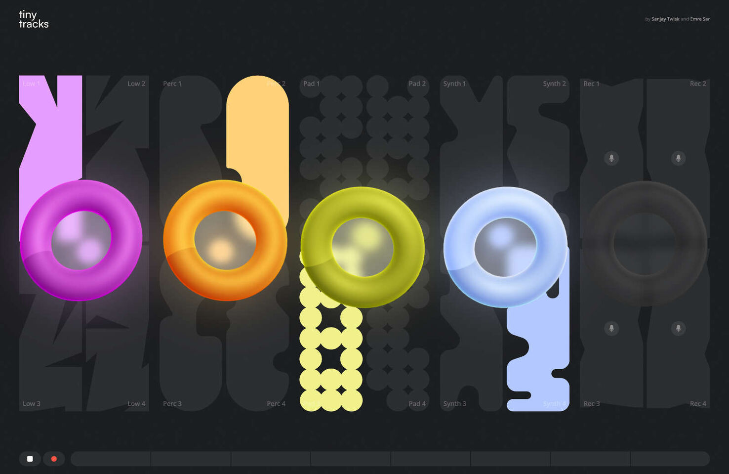
The Y2K aesthetic embraced pinks, purples, blues and greens. Iridescence was a wildly popular approach. These tones were sometimes muted, and sometimes bold neon. Pink especially embodied youthful energy and unbridled enthusiasm. Additionally, purple, historically a symbol of royalty and luxury, was reimagined in its neon form, representing creativity and imagination. Meanwhile, blue, unapologetic and lively, brought a burst of energy that mirrored the rapidly evolving digital culture and pace of innovation.
Organic Forms
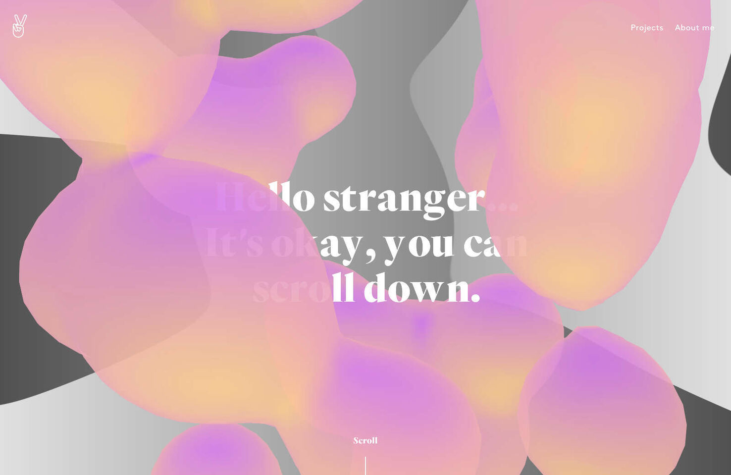
In contrast to the structured and confined corporate designs of the early 90s, the Y2K aesthetic embraced more organic forms. These shapes were not merely arbitrary curves but represented the new millennium’s fluidity, dynamism, and limitless potential. The curves were interwoven, edges blurred, and the designs appeared alive and pulsating with energy. This movement and fluidity hinted at the adaptability and transformative nature of the times.
Blobs & Glossy Orbs
Blobs were a prominent feature during the Y2K era of web design. With their shiny appearance, these shapes were frequently used as clickable buttons. They were more than just blobs; they represented the future, welcoming and subtly animated. On the other hand, orbs added a touch of elegance. They resembled bubbles or liquid mercury, reflecting their environment with a shimmering effect. This suggested a polished, advanced world that was easily attainable.
Transparent Elements
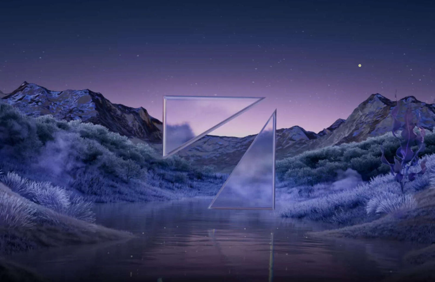
Adding transparent elements to design is like providing a glimpse into the future. Multi-layered designs with see-through components create depth on web pages, making them seem less like flat canvases and more like multidimensional portals. These design choices, such as translucent navigation bars and floating transparent icons, represent clarity, openness, and the potential for new discoveries.
Gradients
During the early 2000s, gradients became a popular design element that embodied people’s hopes and expectations for the future. The Y2K aesthetic marked a shift away from plain, single-color designs as gradients seamlessly transitioned from one hue to the next. These gradients represented more than just color transitions; they symbolized humanity’s yearning for progress and a desire to transition effortlessly into a new era. In essence, the gradient was a visual representation of a dream that combined the familiar with the innovative and the past with the future.
Non-Metallic Metal
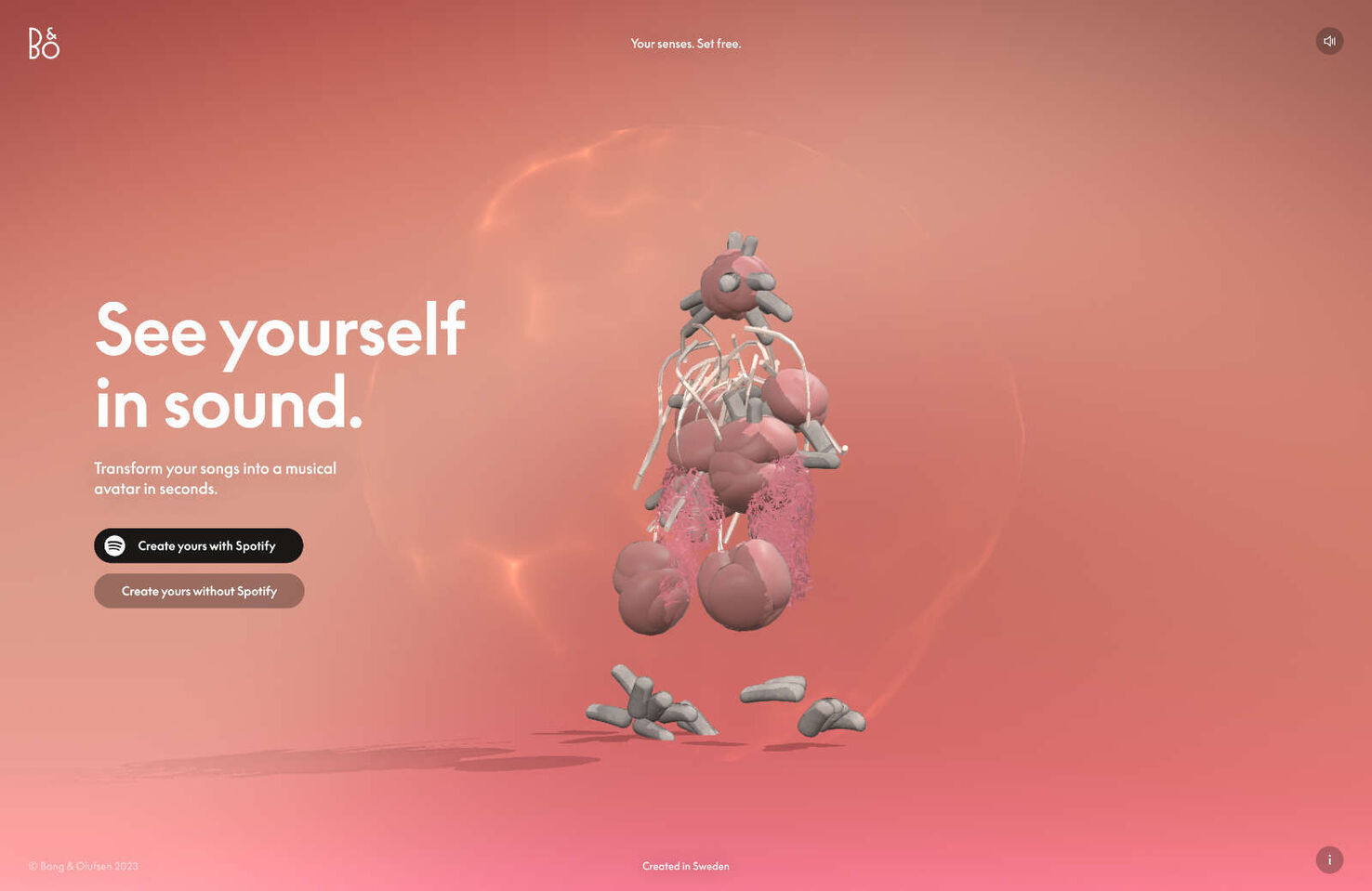
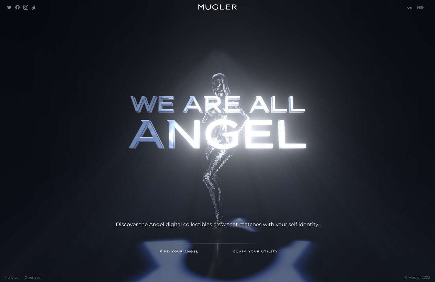
Metallics were a must-have element in any design to capture the essence of the year 2000. Achieveable in print, on screen designers got good at faking chrome. Silver, in particular, was a popular choice and could be found in website backgrounds and product designs. Its shiny appearance evoked the vastness of the universe and the excitement of exploring new frontiers. Chrome accents added a touch of elegance with their reflective and polished finish. Together, silver and chrome embodied the futuristic aesthetic, giving everything a streamlined and modern feel that was perfect for the world of tomorrow.
Y2K’s Cultural Impact
As we entered the new millennium, the Y2K aesthetic became a pervasive cultural movement that wasn’t limited to just web or graphic design. It seeped into all aspects of society, leaving an unmistakable and vibrant mark on the era’s cultural fabric. From advertising and cinema to fashion, everyone embraced the Y2K aesthetic.
It represented our collective hopes, anxieties, and dreams as we stepped into the unknown territory of the 21st century. It became the visual language of an era that stood at the crossroads of the analog past and digital future, capturing the essence of a time when anything seemed possible.
To recapture the Y2K spirit in your designs:
Use metallic finishes and liquid textures;
Incorporate glass-like transparency for depth and dimension;
Use shimmering text or moving gradients;
Float shapes across the screen, reminiscent of early screensavers;
Experiment with asymmetrical designs;
Overlap elements for depth and intrigue;
Opt for readable yet techno-inspired fonts;
Use 3D renders, chrome effects, and neon lines.
The Timeless Appeal of the Y2K Aesthetic
The Y2K aesthetic has left an undeniable mark on design and culture, from the anxious anticipation of the new millennium to the explosion of neon lights and metallic sheens across various media. It emerged at a time when the world was filled with both trepidation and optimism, capturing our collective heartbeat as we took uncertain steps into the 2000s.
The Y2K aesthetic pushed the boundaries of design with its unique shapes, challenging the conventions of the time and redefining what was considered futuristic. The mesmerizing dance of organic forms, glossy orbs, and transparent layers evoked a sense of motion and progress. At the same time, the palette of neon shades and metallics painted a vivid picture of a world eager for innovation yet nostalgic for simpler times.
What’s truly remarkable is how the Y2K aesthetic transcended its time, leaving an indelible impact on the cultural zeitgeist. It influenced fashion, movies, music, and even the nascent digital spaces that were beginning to shape the modern world.
Today, the allure of the Y2K aesthetic remains undiminished. Perhaps it’s the pull of nostalgia, a yearning for a time when the future was a canvas of endless possibilities. Or, in an era of rapid technological advancements, it serves as a reminder of our first collective step into the digital age. Either way, the Y2K aesthetic is not merely a relic of the past but a testament to the human spirit’s constant quest for progress, innovation, and a brighter tomorrow.
Looking back, we can’t help but appreciate this unique era’s vibrancy, reminding us of a time when we looked forward with hope, wonder, and boundless imagination.
Simon Sterne
Simon Sterne is a staff writer at WebdesignerDepot. He’s interested in technology, WordPress, and all things UX. In his spare time he enjoys photography.
https://mobimarket.gosite.uk/wp-content/uploads/2023/09/unseen_0d0dcdb45e6eb89b4dbd7379b0730ab6.jpg9591476Edwin Georgehttps://mobimarket.gosite.uk/wp-content/uploads/2019/05/logonew-1.pngEdwin George2023-08-30 12:30:002023-08-30 12:30:00Everything You Need to Know to Embrace the Y2K Design Trend
Amazon’s Fallout movie has been in the works for a few years now. Die-hard fans have been eagerly awaiting an update ever since the first announcement. The TV series is based on the popular post-apocalyptic gaming franchise of the same name and will broadcast on Amazon Prime sometime in 2024.
Unfortunately, eager fans got more than they bargained for last week when Amazon released a poster to promote the Fallout series. Users were quick to point out that the illustration contains several oddities, suggesting it was created by AI.
At first glance, everything seems in order. The illustration depicts Vault Boy, the Fallout franchise’s iconic mascot, on a billboard for pre-war Los Angeles. On closer inspection, however, the image contains some strange anomalies.
For example, why does the red car in the foreground have two front ends? Why do so many of the buildings in the background have no windows or doors? Why are there people walking in the middle of the road? One eagle-eyed user even noticed that the individual underneath the mascot’s left hand appears to have three legs.
If you’ve been keeping up to date on Generative AI, you’re likely already familiar with AI art. You provide a prompt, pick a style, and hit generate to get a ready-made image. It’s fast, cheap, and completely unpredictable — entirely like buying a burger from one of America’s fast food chains.
The inherent problems with AI mean it’s usually seen as a cheap way to create illustrations without paying an actual designer to do the job correctly. Amazon, presumably, has no shortage of cash to blow on fancy graphics. Users were quick to point out their frustration that a multi-billion dollar company couldn’t be bothered to hire an artist to design their illustration.
If Amazon was intent on doubling down in defence of its poster, I’m sure they could play off the art as some sort of surrealist work of genius. Perhaps the image is an interpretive masterpiece revealing the effects of taking one too many Day Trippers or other Fallout universe pre-war chem.
Unfortunately, even if Amazon played the ‘it was all intentional’ card, I’m not convinced the internet would let them off the hook that easily.
Max Walton
Born in Cardiff Wales, Max relocated to Brisbane when he was 12. He’s spent the last five years developing expertise in the Fintech industry. When he’s not posting about Web3, you’ll find him on a paddleboard.
https://mobimarket.gosite.uk/wp-content/uploads/2023/09/Amazon-Releases-Terrible-AI-Art-for-Fallout-MovieE28094Chaos-Ensues.jpg10401600Edwin Georgehttps://mobimarket.gosite.uk/wp-content/uploads/2019/05/logonew-1.pngEdwin George2023-08-29 22:30:002023-08-29 22:30:00Amazon Releases Terrible AI Art for Fallout Movie—Chaos Ensues
WhatsApp has been millions of Americans’ go-to messaging service for over a decade now. And it’s showing no sign of slowing down. The social media giant has been continually adding features for years, with the service gaining new updates almost daily on the beta channel.
Now, WhatsApp has unveiled its latest update. The new beta for Android 2.23.13.16 features an entirely redesigned UI. Among the changes include a new all-white top bar and a universally green aesthetic (similar to WhatsApp’s iconic logo).
The new update will also introduce chat filters, allowing you to see your unread, business, or personal messages at a glance.
The goal of these changes is to give WhatsApp a more modern feel and aesthetic. And, let’s be honest, the app really needs it.
Despite its incredible functionality, WhatsApp currently lags behind in the UI department. The platform feels dated and sluggish compared to modern social media networks like Instagram and Snapchat.
Here’s to hoping an updated interface can breathe new life into the platform and help WhatsApp retain its throne as the undisputed king of all messaging apps. The beta hasn’t been released to the public yet, but we can expect it to arrive sometime later this year.
Robert Reeve
Robert is an experienced marketing professional with extensive experience working with brands to refine go-to-market plans, SEO campaigns, and content marketing strategies. A committed writer with a keen eye on the latest developments, Robert specialises in producing content across all things tech and marketing.
https://mobimarket.gosite.uk/wp-content/uploads/2019/05/logonew-1.png00Edwin Georgehttps://mobimarket.gosite.uk/wp-content/uploads/2019/05/logonew-1.pngEdwin George2023-08-29 20:00:002023-08-29 20:00:00WhatsApp’s New UI Redesign—Here’s What You Need to Know
When Elon Musk rebranded Twitter to ‘X’ back in July, many of us initially assumed it was a poor attempt at a late April fools joke. Slowly, though, we began to realize that Musk was serious. Twitter’s iconic blue bird was gone for good.
Musk has made several changes to the ‘X’ logo since its conception, including making it bolder (before reversing the change) and, most recently, adding edgy white stains to the icon’s background.
Sadly, none of Musk’s changes have made it any easier to get over the death of Twitter’s blue bird. We’ve simply had to sit back and accept that the blue bird is gone from the site forever. It’s been a bitter pill to swallow.
Now, however, one organization is offering a way to bring the bird back. The World Parrot Trust (WPT) recently launched an appeal on X, asking Musk to donate the defunct Twitter logo to them.
The international charity believes the design could be used to raise awareness about the potential extinction of The Lear’s Macaw, an endangered parrot native to Brazil. The WPT states the famous blue bird logo could spark interest in the charity, helping to support their conservation efforts.
So, what’s Musk’s next move? Clearly, he has no intention of reviving the Twitter brand, so why not donate it to a worthy cause? This would be an excellent opportunity for Twitter’s mercurial owner to piece together pieces of his tattered reputation after an abysmal 2023.
But, if we’ve learned anything about billionaires over the last decade, they rarely give things away without solid personal incentives. Will Musk really be moved enough by the plight of Lear’s Macaw to give up Twitter’s trademarked logo? Time will tell.
There are currently fewer than 1700 Lear’s Macaws in the wild. The parrot is threatened by habitat loss, hunting and the wild bird trade. You can find out more about the species and donate today by visiting the WPT website.
Robert Reeve
Robert is an experienced marketing professional with extensive experience working with brands to refine go-to-market plans, SEO campaigns, and content marketing strategies. A committed writer with a keen eye on the latest developments, Robert specialises in producing content across all things tech and marketing.
https://mobimarket.gosite.uk/wp-content/uploads/2023/09/World-Parrot-Trust_0d0dcdb45e6eb89b4dbd7379b0730ab6.jpg9591476Edwin Georgehttps://mobimarket.gosite.uk/wp-content/uploads/2019/05/logonew-1.pngEdwin George2023-08-28 21:00:002023-08-28 21:00:00Twitter’s Extinct Blue Bird Logo Could Save a Real Blue Bird
In this post, we’ll look back at the story of the iMac, from its audacious birth to its impact on popular culture. We’ll cover its leaps in performance, its innovation, and the way it saved Apple from bankruptcy and made it the number one tech company on earth.
Whether you’ve been a fan for the last quarter century or just appreciate a good redemption story, there’s a chapter of the iMac’s history for you. But let’s start, like all good stories, at the beginning.
The Birth of the iMac, 1998 – 2001
Steve Jobs returned to Apple in 1997 after a long hiatus. The break allowed him to realize something fundamental – computers shouldn’t just be functional but attractive and user-friendly. The essence of Apple was always about melding technology with the liberal arts, creating products that not only worked but resonated on a deeply human level. The result? The iMac.
This innovative idea may be the most crucial concept in the last century. Jobs’s vision brought aesthetics to the forefront, making our devices not just tools but extensions of our style.
The Bondi Blue G3
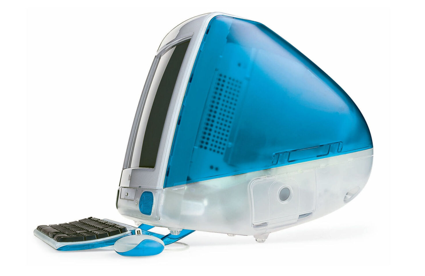
The name might sound exotic, but the Bondi Blue G3 was nothing short of revolutionary. Housed in a translucent, egg-shaped case, this machine shattered the mold of beige boxes that flooded the 90s computer market.
Apple named this iconic design after the famous Bondi Beach in Australia, renowned for its clear waters and unique hue of blue.
The colorful, see-through design was more than just a fresh look; it represented transparency, simplicity, and a break from convention.
Dropping the Floppy for USB
Along with a new style came a new attitude that would continue to define Apple’s approach: the floppy disk was old, and USB was new, so Apple dropped the floppy.
The reason was clear: the future lay in universal connections. USB ports, back then, were a novelty, but Apple saw their potential:
Speed: USBs were faster, offering quicker data transfer.
Versatility: A single port type for multiple devices? Yes, please!
The Future: Floppies had limited storage, and their days were numbered.
Today, we enjoy seamless connections between devices, and this daring move by Apple played a pivotal role in this universal compatibility we often take for granted.
iMac as an “Internet Machine”
Back in the ’90s, the internet was still a novelty — in fact, it was so new many predicted it was a fad that would die out before the year 2000.
Apple seized this trend with the iMac’s name – the “i” stood for the internet. They promised easy, out-of-the-box internet connectivity: no more complex setups or baffling configurations. Just plug in, power up, and you’re online.
The iMac made the internet easy for people who didn’t have the same kind of IT support that businesses enjoyed. Simplifying internet access made it possible for households to get online.
As a result, millions of kids who would never have encountered tech until they left for college started tinkering with the web.
At the heart of the iMac’s birth was a desire to push boundaries and redefine what a personal computer could be. Through design, innovation, and sheer audacity, Apple embarked on a journey that you, as a user, continue to be a part of with every device you power up.
The G4 Era, 2002 – 2004
The iMac G3 era featured various color options, including patterns. It seemed like Apple had a winning product design that would run for years, but Apple wasn’t about to rest on its laurels. Cue the G4 era, a period where Apple took another leap into the future, both in design and functionality.
A Futuristic Design Transition
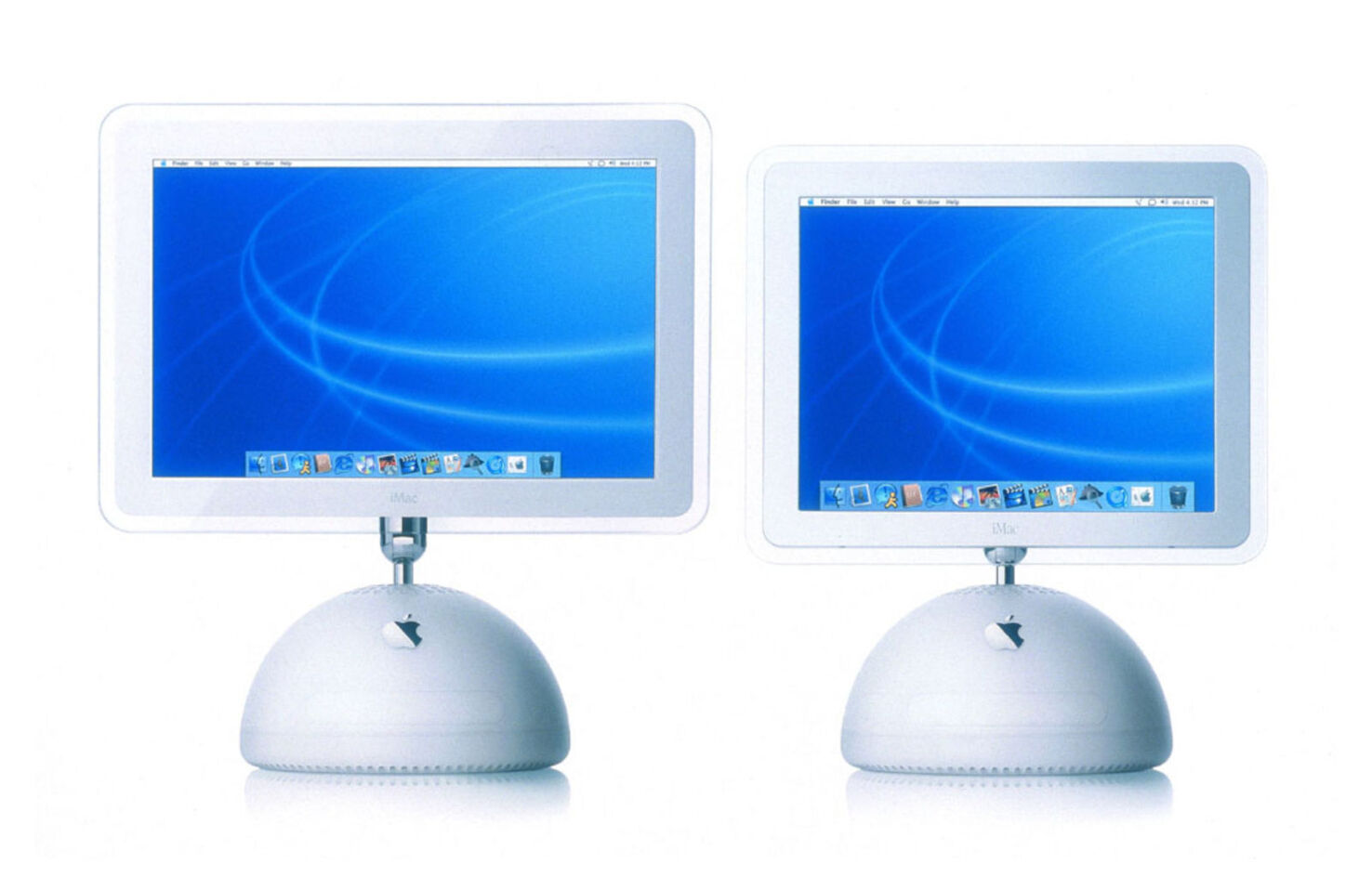
Move over egg-shaped designs; the iMac G4 was here to redefine chic! Reminiscent of a luxurious desk lamp, the G4 sported a flat-panel display mounted on a highly adjustable arm. This wasn’t just aesthetic brilliance; it was ergonomic innovation. This design allowed users to easily adjust the screen to their preferred viewing angle.
Anyone who owned a G3 iMac will remember stacking books to raise the viewport to a comfortable height. The G4’s adjustable arm was Apple’s early acknowledgment of user comfort. The company wasn’t just selling computers; they were selling an experience.
Performance Enhancement with the G4 Chip
If the design was groundbreaking, the G4 chip’s performance was earth-shattering. It boasted:
Velocity Engine: An ability to handle 128 bits of data in a single cycle. (At the time, that was a lot.)
Enhanced Multimedia: The chip excelled at complex tasks like image rendering and video processing.
Increased Speeds: With speeds ranging from 350 to 500 MHz initially, later models would even touch 1.42 GHz.
Imagine running your modern apps on older processors – frustrating, right? The G4 chip was a blessing for those wanting to run multimedia applications without lag or hang-ups. It was all about giving you a smoother, faster experience.
The Introduction of the iLife Suite
Apple wasn’t just focusing on hardware; the software got some love, too. Apple introduced the iLife suite, bundling key multimedia applications:
iPhoto: Your gateway to organizing, editing, and sharing photos.
iMovie: Making movie editing accessible to everyone, not just professionals.
GarageBand: Ever dreamed of creating music? This was your tool.
iDVD and iWeb: Making DVD creation and website design more straightforward than ever.
Gone were the days when you needed tech expertise or professional software to get creative. With iLife, Apple democratized creativity. Whether you were a budding photographer, an amateur filmmaker, or someone who loved experimenting, iLife was your playground.
The G4 era was emblematic of Apple’s commitment to pushing the envelope. It wasn’t just about making another computer but about reimagining what computing could feel like. And if you were a user during this era, you didn’t just own a machine; you owned a piece of the future.
The G5 and Intel Transition, 2004 – 2007
Navigating the tumultuous waters of technological change is never easy, but Apple’s journey from the G5 to Intel is a testament to its ability to adapt, innovate, and redefine.
It was a little bumpy along the way — no one wants to buy an instantly obsolete computer, but Apple found intelligent ways to handle a very difficult change.
The All-in-One Design
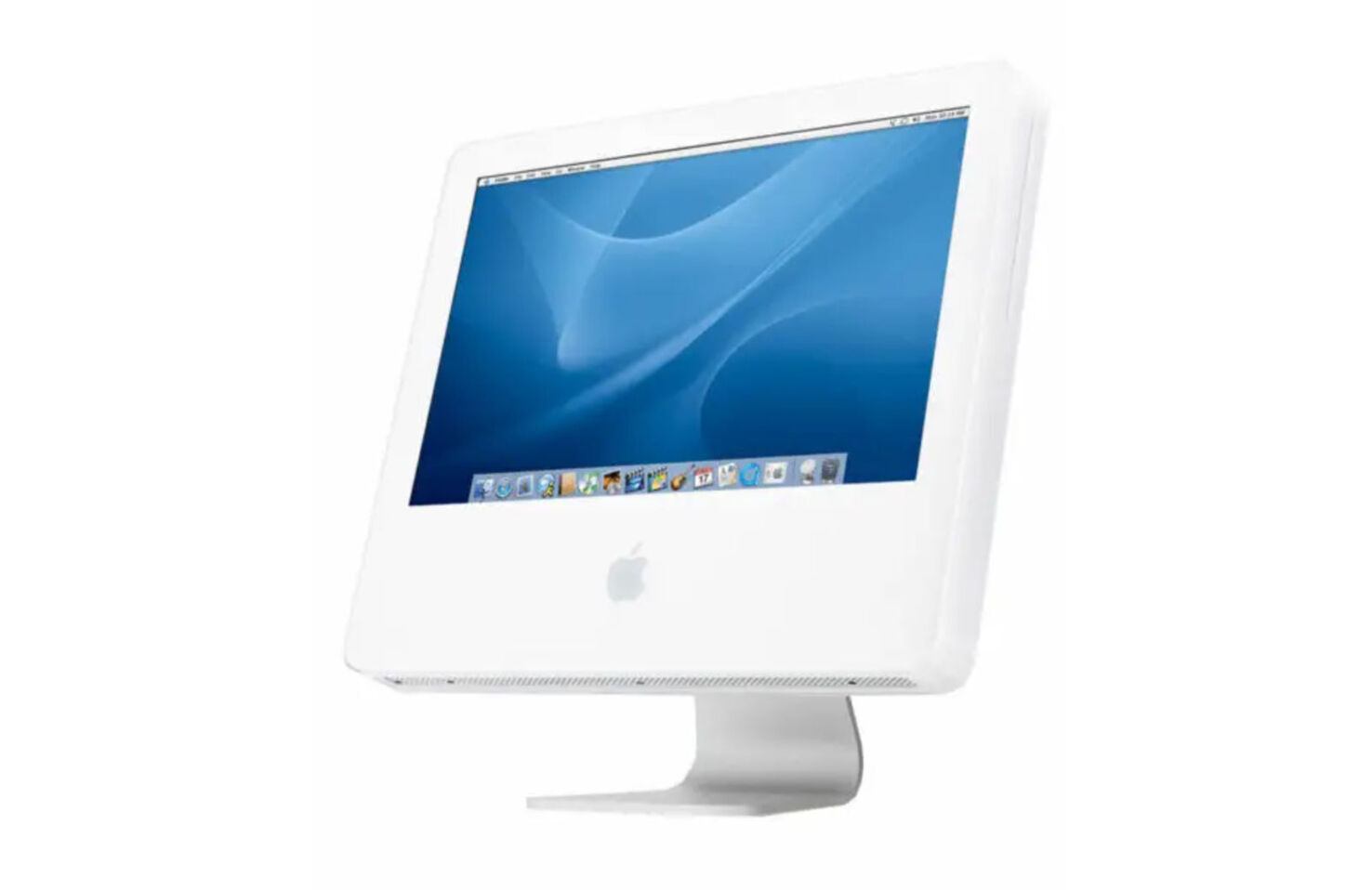
But Apple wasn’t just stopping at the internals. The G5 iMac introduced the iconic all-in-one design. Sleek, minimalist, and incredibly modern. Far more in keeping with the original vision of the iMac as a single object.
At first, this design was created in polycarbonate, but it heralded the aluminum approach that Apple would adopt in a few short years.
The G5 introduced a faster, more streamlined computing experience. The G5 wasn’t just a powerhouse but a stylish addition to any desk or workspace.
Introduction of the G5 Chip
The G5 was a behemoth in its time. Apple touted it as the “world’s fastest personal computer,” and it didn’t disappoint:
PowerPC 970: Built on the IBM PowerPC 970 architecture, the G5 offered 64-bit processing.
Superior Graphics and Audio: Ideal for content creators and gamers alike.
The Shocking Intel Incident
No journey is without its challenges, and Apple faced a few with the G5:
Heat Issues: The G5 was powerful but ran hot, leading to complicated cooling solutions.
Limited Mobility: The heat and power consumption meant G5 wasn’t suitable for Apple’s laptops, which were borrowing iMac tech.
Performance Plateau: There was only so much the G5 could offer in terms of speed and efficiency.
Enter Intel. In 2005, Steve Jobs made a historic announcement: Apple would transition to Intel processors. This was monumental. It wasn’t just a chip change but a complete shift in architectural direction.
Many Apple enthusiasts were horrified at the idea of adopting a PC processor.’ It’s no exaggeration to compare Apple’s Intel move with Dylan’s switch to electric guitar. But like Dylan, the switch opened Apple up to new heights of innovation.
Improvements in Software Compatibility and Performance with Intel
The switch to Intel was more than just hardware deep. The real magic lay in the software:
Rosetta: A translation process allowed you to run older, PowerPC-based apps on new Intel Macs. Which meant your copy of Photoshop would keep working.
Boot Camp: Ever wanted to run Windows on your Mac? Now you could, natively. At a time when Windows still got the majority of new software, this was a game-changer.
Universal Applications: Developers began creating apps that worked on both PowerPC and Intel Macs, ensuring you didn’t miss out regardless of your machine.
The outcome? A smoother, more versatile user experience. Your iMac was now a symphony of compatibility, flexibility, and raw power.
The G5 to Intel transition was more than a technological evolution. It was a statement, a commitment to us, the users. Apple showed they weren’t afraid to make tough decisions to ensure we always had the best computing experience possible. And in this era, they proved it in spades.
The Aluminum Unibody Era, 2007 – 2015
In the ever-evolving tale of the iMac, the Aluminum Unibody era stands out for its technological advancements and commitment to design excellence. As aesthetics became a pivotal part of the tech conversation, Apple again rose to the occasion, ensuring you didn’t just have a machine – you had a lifestyle.
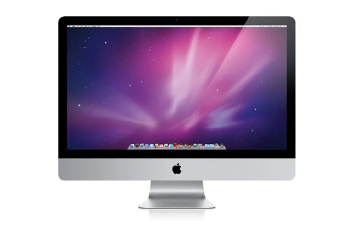
Thinner Design, Edge-to-Edge Glass, and LED Backlighting
The Aluminum Unibody iMac wasn’t just another computer; it was a work of art:
Svelte Profile: Apple slimmed down the iMac’s chassis, making it sleeker and more modern.
Edge-to-Edge Glass: Gone were the bulky bezels, replaced by a seamless edge-to-edge glass design that elevated screen immersion.
LED Backlighting: Not only did this offer brighter, more vibrant visuals, but it also consumed less power and allowed for a thinner display.
iMacs of this era were visually stunning workhorses that didn’t compromise screen quality. It wasn’t just about getting tasks done; it was about enjoying every pixel of the journey.
Introduction of the Magic Mouse and Multi-Touch Trackpad
With the iMac’s design evolving, Apple knew the peripherals needed a facelift too:
Magic Mouse: The world’s first multi-touch mouse, allowing you to swipe and scroll directly on its surface.
Multi-Touch Trackpad: Borrowing from the iPhone’s playbook, this trackpad recognized gestures, transforming how you interacted with content.
Navigating your digital world with a flick, pinch, or swipe. Efficiency met elegance, and your fingertips were in control.
Enhanced Performance and Emphasis on Eco-Friendliness
Apple’s focus wasn’t solely on the external. The insides of the iMac got a boost, too:
Performance Gains: Thanks to new processors and graphics cards, tasks were faster, and graphics more fluid.
Greener Tech: The Aluminum Unibody iMac was PVC-free, BFR-free, and met ENERGYSTAR5.0 requirements.
Recyclable Materials: Aluminum and glass, both highly recyclable, formed most of the iMac’s body.
Not only did you get a faster and more responsive machine, but you also made an eco-friendly choice. Every time you powered on your iMac, you were part of a greener tech revolution.
The Aluminum Unibody era showcased Apple’s dedication to pushing boundaries in form and function. For users, it redefined what it meant to own a computer. It was no longer just about specs and speeds but about style, sustainability, and a seamless experience.
The Retina Display Era, 2014 – 2022
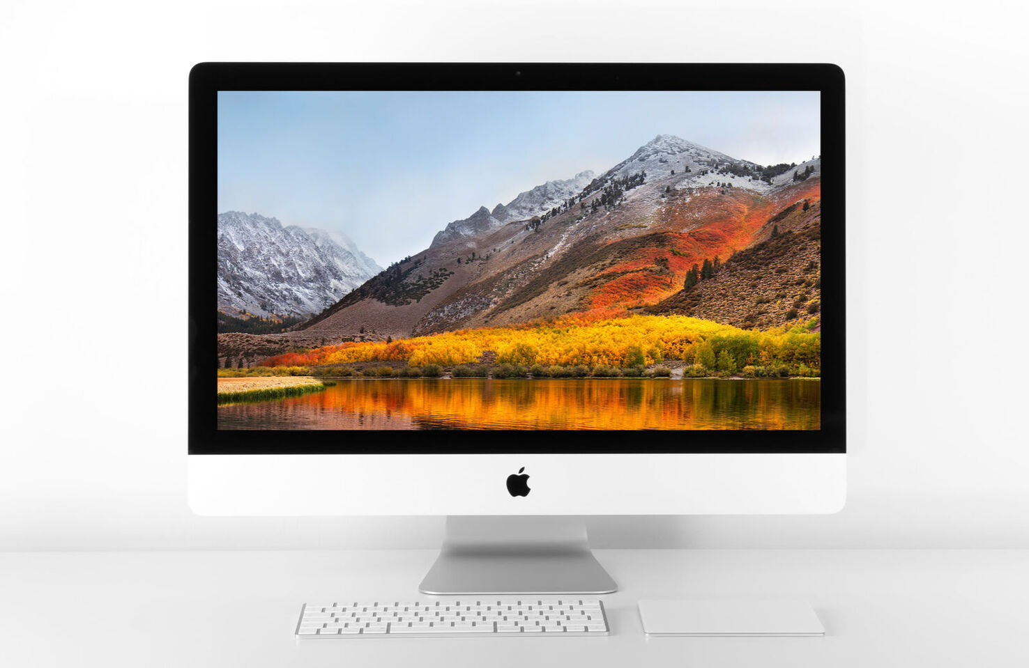
Just when you thought the iMac couldn’t get any better, Apple ushered in the Retina Display Era, revolutionizing how we perceive and interact with digital content. We were immersed in high-resolution visuals like never before.
Introduction of Retina 5K Display: A Game-Changer in Visual Experience
Remember the first time you saw HD content and thought it was lifelike? The Retina 5K display took that sentiment and magnified it:
Unparalleled Resolution: With 14.7 million pixels, it delivered visuals four times crisper than standard displays.
Stunning Clarity: Text was razor-sharp, images boasted incredible detail, and videos became cinema-like experiences.
Seamless Integration: Despite its prowess, the Retina display seamlessly integrated into the iMac’s slim design.
No more squinting or zooming in. Everything, from reading emails to editing photos, became a treat for the eyes. Pixels became a thing PC users worried about.
Enhanced Color Accuracy and Performance Boosts
But Apple didn’t stop at resolution:
True-to-Life Colors: The Retina display showcased a wider color gamut, bringing more vibrant and accurate colors.
P3 Color Space: This tech jargon translates to richer reds, deeper blues, and more responsive greens for you.
Performance Tweaks: Behind this display were powerful processors and memory upgrades, ensuring smooth operations even with the most demanding tasks.
Whether you were a professional designer or just appreciated good visuals, the iMac now offered a canvas that truly replicated the natural world’s colors and nuances.
Focus on Content Creators with Improved Graphics and Processing Capabilities
Apple recognized a growing demographic: content creators. The iMac with Retina display was their love letter to this community:
Powerful Graphics: GPUs capable of driving the Retina display while managing intense graphic workflows.
Faster Processors: Multitasking, rendering, or just day-to-day operations, everything felt snappier.
Optimized Software: Tools like Final Cut Pro and Photoshop were enhanced to make the most of the Retina display.
If you dabbled in content creation, be it video editing, graphic design, or photography, the iMac became your trusted partner. It paved the way for the creator economy and meant anyone could work with a professional-grade machine.
As the pages of the iMac’s story turned, the Retina Display Era marked a chapter where technology met artistry — this period signified a shift from mere computing to an era of visual marvels and unmatched creative potential. Every glance at the iMac was a reminder of how technology could elevate human experiences.
The M Chip Era, 2021 – 20??
As we venture into the contemporary chapter of the iMac’s journey, we find ourselves in an era of vibrant aesthetics, groundbreaking performance, and an interconnected Apple universe. The modern iMac isn’t just an update — it’s a revolution, embodying the future while nodding to its colorful past.
M1&M2 Chip Integration
After the shock adoption of the Intel processor, Apple’s announcement of its own M1 (and, a couple of years later, M2 chips) is the final twist in the tale — so far.
Apple’s transition to its own chips is akin to a bird finally taking flight on its own:
Blazing Speeds: Applications launch instantly, and tasks are completed before you know it.
Integrated Design: By controlling both hardware and software, Apple ensures everything runs seamlessly.
The switch to Apple’s Silicon processors marks a seismic shift in computing prowess. Leaving Intel behind is a bold move that underscores Apple’s confidence in its innovation trajectory.
So far, it has paid off, with M1 and M2-powered Macs not just faster but noticeably faster than their older siblings.
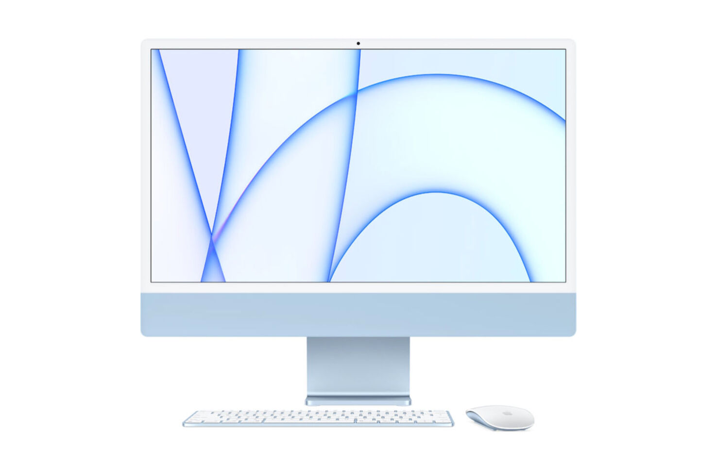
Major Redesign with Thinner Profiles, Vibrant Colors
The modern iMac isn’t just an evolution; it’s a visual and technological marvel:
Sleeker than Ever: An ultra-thin profile that makes it hard to believe it houses such power.
A Nostalgic Palette: A splash of colors reminiscent of the original iMac but with a sophisticated, matte finish.
The current range iMac is not just functionally robust but a statement piece, adding a pop of personality to your workspace. It’s a noticeably snappier, more efficient computing journey, redefining what you expect from a desktop.
The Move Toward a Unified Apple Ecosystem
Apple’s vision isn’t limited to just one product; it’s about creating a harmonious digital environment:
Universal Apps: Software that runs beautifully on your iMac, iPad, and MacBook, ensuring consistency across devices.
Greener Computing: With Apple’s chips, the iMac consumes less power while delivering superior performance.
One Apple Universe: With each product release, the lines blur, creating a seamless experience whether you’re on your iMac, iPhone, or Apple Watch.
It’s not just about using a device; it’s about living in an intuitive, interconnected, and incredibly user-friendly ecosystem.
With the modern iMac, Apple isn’t just offering a computer; they’re gifting you an experience. It blends the past’s nostalgia with the future’s promise. As you power it on, you’re not just starting a device but stepping into a brighter, more colorful, and incredibly efficient digital future. Welcome to the new age of computing!
The Cultural Impact of the iMac
Beyond the technical specs and design marvels, the iMac has left an undeniable cultural imprint on the world. You’ve likely felt it, too, even if you haven’t realized it. The ripples of its influence have touched not just the tech realm but our daily lives, popular culture, and the broader zeitgeist.
Changing Workspaces Forever
Before the iMac, computers were often large, bulky, and, let’s face it, unattractive. The iMac changed all that:
Design-Forward: Suddenly, computers were chic, sleek, and something you wanted to showcase, not hide.
Workspace Revolution: Open-plan offices and modern workspaces embraced the iMac as both a tool and a design piece.
Personal Expression: With the iMac’s various colors and designs, your computer becomes an extension of your personality.
Your desk wasn’t just a workspace any longer. It became a style statement, a conversation starter, and a reflection of you.
Inspiring a New Generation of Creators
Apple’s focus on design and usability made technology more accessible and appealing:
Democratizing Design: With its user-friendly interface and powerful tools, many budding designers and creators got their start on an iMac.
Fueling Creativity: Think of the countless YouTube videos, podcasts, and digital artworks birthed from this machine.
Spotlight on Accessibility: Apple’s commitment to inclusive design ensured everyone could create regardless of their abilities.
The iMac wasn’t just a machine; it was a muse, constantly nudging you to explore, create, and share.
Shaping Popular Culture
The iMac’s iconic design and features made their way into movies, TV shows, and even the music world:
Hollywood’s Favorite: Whether it’s a futuristic sci-fi scene or a modern-day office drama, the iMac often plays a starring role.
Trendsetter: The colorful iMac G3s became cultural symbols of the late ’90s and early 2000s.
Influence on Competitors: Many tried (and failed) to emulate the iMac’s unique blend of form and function.
Whenever you spotted an iMac in a movie or TV show, it was a little nod to a shared cultural moment, a silent acknowledgment of its iconic status.
The iMac didn’t just change how we compute; it changed how we perceive technology in our cultural landscape. It’s not just about bits and bytes, pixels and processors. It’s about the stories, emotions, and connections the iMac has fostered over the years.
The iMac’s Remarkable Story
From its birth as an outsider to reigning as a design classic, the iMac’s journey is nothing short of legendary.
Web designers, creatives, and everyday users: we all became smitten. Its blend of aesthetics and capability made it not just a tool but a partner in our digital endeavors.
As you boot up your iMac, remember you’re not just using a computer; you’re interacting with a cultural icon. 🖥️✨
Simon Sterne
Simon Sterne is a staff writer at WebdesignerDepot. He’s interested in technology, WordPress, and all things UX. In his spare time he enjoys photography.
https://mobimarket.gosite.uk/wp-content/uploads/2023/08/g3_0d0dcdb45e6eb89b4dbd7379b0730ab6.jpg9591476Edwin Georgehttps://mobimarket.gosite.uk/wp-content/uploads/2019/05/logonew-1.pngEdwin George2023-08-25 12:30:002023-08-25 12:30:00The Evolution of the iMac 1998–2023
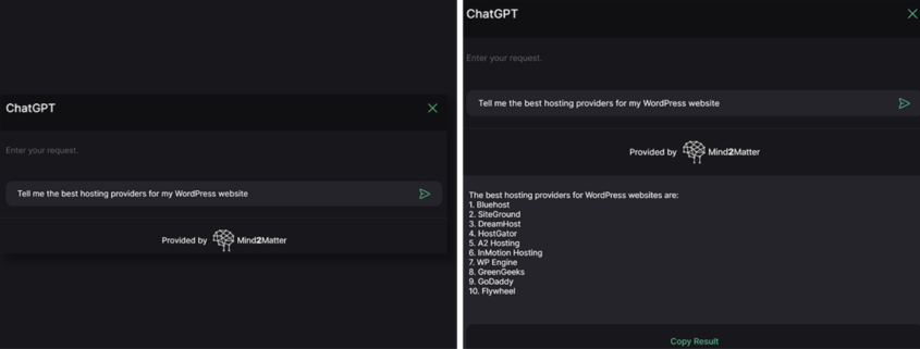
Created by the experienced team at Mind2Matter, this ChatGPT WordPress Plugin allows you to create content, answer customer queries, and much more.
[embedded content]
You can use the plugin for your backend admin, generating content to boost your traffic. Or, you could make it available to logged-in users, so you can collaborate. Alternatively you could make it available on your front-end so your site visitors can use it. Or, for the ultimate in labor-saving, why not do all three!
Ask ChatGPT anything — no matter the topic, ChatGPT can guide you through it.
Generate content — easily generate thousands of words, then copy and paste it into your posts and click ‘publish.’
Receive guidance — have AI assist you increase your productivity by 100x.
The only limitation is your own creativity.
This incredible ChatGPT WordPress plugin comes with a lifetime license, and you can use it with the free, or plus versions of ChatGPT — just insert your account details from OpenAI.
Best of all, right now you can snag this WordPress plugin for just $59.99, that’s an incredible 79% saving off the regular $299 price tag. All you need to run it is an OpenAI account (even the free version!) and a copy of WordPress.
WDD Staff
WDD staff are proud to be able to bring you this daily blog about web design and development. If there’s something you think we should be talking about let us know @DesignerDepot.
https://mobimarket.gosite.uk/wp-content/uploads/2023/08/chatgpt_wp_plugin_0d0dcdb45e6eb89b4dbd7379b0730ab6.png5531476Edwin Georgehttps://mobimarket.gosite.uk/wp-content/uploads/2019/05/logonew-1.pngEdwin George2023-08-25 05:00:002023-08-25 05:00:00Slay Your Content With This ChatGPT WordPress Plugin
Döner Haus opened in Lower Manhattan back in March. The company promises real German kebabs — ideal for a quick lunch, take-home dinner, or to soak up the alcohol after spending a long night at a bar.
Unfortunately, however, Döner Haus’ selection of authentic food options has been overshadowed by a slightly more pressing matter— their logo closely resembles that of one of the internet’s largest porn sites.
Pornhub has expressed concern that the logo of DönerHaus could confuse consumers because it’s too similar to the icon of their website. The leading adult website has threatened to take legal action if the issue is not resolved.
In response, Döner Haus marketing manager Pauline Phan argued that the two companies are in entirely different sectors, meaning there’s very little chance of confusion.
Admittedly, the two logos look very much alike, and Döner Haus clearly had an agenda when picking their design. But is this really worth Pornhub’s time and money? Could people actually get a kebab shop mixed up with an adult website? I’m not convinced, but Pornhub seems to think this is a matter that needs addressing.
Despite the apparent similarities, the logo has some notable differences, such as the different shades of orange between the two and the underlining of the word ‘Döner’.
This isn’t the first instance of bigger brands targeting small businesses over logo disputes. Apple, for example, ruthlessly attacked Prepear back in 2020. The crime? Prepear used a pear as a logo. That’s right. It wasn’t even an apple. Thankfully, Apple lost the dispute, and Prepear still uses its fruity icon to this day.
Shelley Cooke
Shelley Cooke is a blogger and podcaster from Asheville, North Carolina (Go Oilers!). She’s passionate about technology and the role it plays in building communities.
https://mobimarket.gosite.uk/wp-content/uploads/2023/08/Pornhub-vs-DC3B6ner-Haus-The-Logo-Battle-of-the-Year.jpg10401600Edwin Georgehttps://mobimarket.gosite.uk/wp-content/uploads/2019/05/logonew-1.pngEdwin George2023-08-24 20:00:002023-08-24 20:00:00Pornhub vs Döner Haus: The Logo Battle of the Year
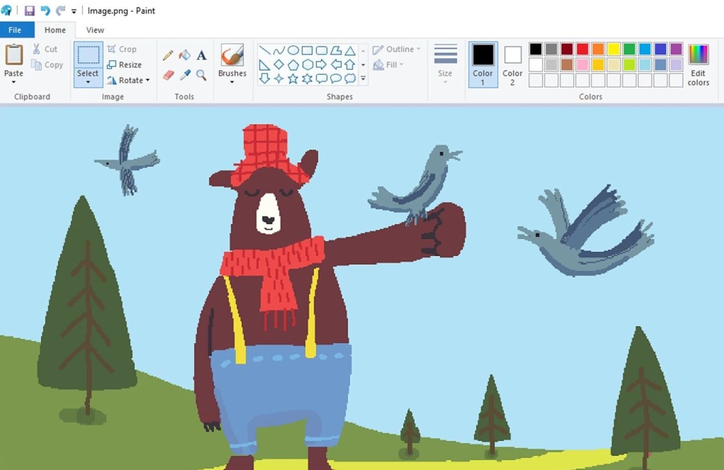
Microsoft Paint is the poster child of a time forgotten. It’s been a standard app on Microsoft PCs for even longer than you think — 38 years, to be precise. That’s right — you could access Paint before accessing the internet. It’s that kind of old.
Now, after trying to kill the historic app in 2017, Microsoft has decided to adopt a new strategy. According to Windows Central, the tech giant is considering incorporating AI capabilities into Paint. Why? Who knows? The article reveals that the update would work similarly to the current Bing AI Image Generator.
What could an AI update to MS Paint possibly entail? Perhaps it would allow users to generate AI images to which they could add hastily drawn scribbles. Drawing mustaches on celebrity faces would provide some amusement, even if just for a second, I suppose.
The main question this new information raises is — why? Why update something that’s already perfect as it is? Okay, hear me out.
Yes, MS Paint is old. It’s outdated. But isn’t that the point? Paint is about doodles and childish fun — not generative fill features, photorealistic imagery, and professional artistry. It’s a relic of a simpler time. Shouldn’t it just stay that way?
Perhaps I’m hopelessly clinging to memories of childhood afternoons spent scribbling on my mother’s home computer here. But I stand proudly on my clumsily scribbled, pixelated pedestal when I say: Please, just leave Paint alone.
Robert Reeve
Robert is an experienced marketing professional with extensive experience working with brands to refine go-to-market plans, SEO campaigns, and content marketing strategies. A committed writer with a keen eye on the latest developments, Robert specialises in producing content across all things tech and marketing.
https://mobimarket.gosite.uk/wp-content/uploads/2023/08/MS-Paint.1_0d0dcdb45e6eb89b4dbd7379b0730ab6.jpg9591476Edwin Georgehttps://mobimarket.gosite.uk/wp-content/uploads/2019/05/logonew-1.pngEdwin George2023-08-23 22:00:002023-08-23 22:00:00Microsoft Contemplates Adding AI to MS Paint
We recently reported on Adobe’s Generative Expand feature, a new function that allows designers to extend photo canvases with AI-generated content. Now, Midjourney has unveiled its own exciting take on the generative-AI trend.
Midjourney unveiled its new “vary (region)” tool this week. The feature allows users to hone in on specific areas of an AI-generated image and randomize them to achieve desired results.
The process is simple. First, type the /imagine command into Discord and provide prompts to generate an image. Then, use the ‘vary (region) tool and highlight the area you’d like to reroll. In the example below, Midjourney has opted for a crown on a mouse.
Finally, hit submit and watch as Midjourney’s AI gets to work. Within seconds, you’ll have a selection of different variations to choose from.
Fortunately, for those of us who aren’t interested in royal mice, Midjourney allows users to generate and edit any images they generate. Unfortunately, designers can’t upload their own images for editing yet, so we’ll have to be content with the ones we generate through the program.
Midjourney notes that the feature can occasionally be unpredictable. They also specify that larger areas are better. For example, if you wanted to change a single ear on the mouse pictured above, you might run into some problems.
Despite these drawbacks, we fully expect Midjourney’s tools to improve as generative AI grows more capable. Whether Midjourney is set to steal the crown from Adobe remains to be seen, but this new feature will certainly give the giants of design some stern competition.
Max Walton
Born in Cardiff Wales, Max relocated to Brisbane when he was 12. He’s spent the last five years developing expertise in the Fintech industry. When he’s not posting about Web3, you’ll find him on a paddleboard.
To maximize your chances of landing a job or client, including information about your work in a case study is essential. This article provides some practical tips on what to include and how to format your document for maximum impact. Regardless of your experience level, this information will be invaluable.
In most cases, your case studies will be primarily visual. So it’s vital that you keep design revisions and screenshots of different aspects of the projects you work on as they evolve.
Many designers like to keep a work diary, or journal, separate from a sketch pad, in which they can jot down their thought processes from the day. This helps immensely when you revisit a project to create a case study.
By breaking away from a purely visual approach to portfolios, you can construct the story of your past projects in a way that impacts your audience. By following the advice in this post, you can create a comprehensive and insightful set of case studies that will stand out from the competition.
Step 1: Overview
Every case study starts with an introduction that includes two critical elements:
Summary — Like any content, from a blog post to a novel, it helps to set the scene with a solid introduction. Don’t go overboard; a paragraph will be enough. One pro-tip is to write the introduction last; that way, there’s a better chance it will reflect the rest of your writing.
Your Role — There’s only one reason someone is reading your case study: to learn about what you did. Explain your role in the project, cover what you were responsible for, and what was someone else’s job — you don’t want to turn off potential clients over a terrible logo if it was handed to you by your client. Likewise, people appreciate you crediting others where appropriate. Ensure you’re clear about what you did and did not do; assumptions often lead to misunderstandings.
Step 2: Explain the Problem
Every excellent case study is a story of how you overcame a problem. To engage your reader, you need to set the stage with you as the hero. Why were you even necessary? What was the problem the business faced?
There are countless problems that businesses face, but they tend to revolve around three things:
Correcting Failures — Sometimes, a business has embarked on a process and has not met its goals. It may have launched a website that isn’t connecting with its audience. Or, it may have taken on too much work for its infrastructure to handle.
Maintaining Position — Very rarely does a business trade at a consistent level. There are ups and downs, even if they are seasonal. When a business grows, it needs to consolidate that position to expand further.
Upscaling — Growth is the most straightforward business challenge to explain to a user. Increasing market reach, increasing profit, and increasing brand awareness; these are all common goals.
Show potential clients that you can understand their customers by breaking down the project’s target demographic. Who is the project trying to help? How does the problem impact them? What do you know about them that informed your solution?
Step 3: Explain the Objective (With Numbers)
It’s vital that you explain the objective clearly, and the best way to do that is with actual figures. Try to use percentages where possible — not everyone understands what an extra 1,000 users mean in the context of your case study, but everyone understands a user growth of 50%.
State the goals for the project clearly, for example:
A 500% increase in subscribers;
A 75% reduction in bounce rate;
A 30% increase in monthly revenue;
A 25% decrease in support requests.
But remember, your client’s business data is private. Be careful what you share — especially if you signed an NDA. Most companies will be okay with you saying you increased orders by 50%, but they won’t want you to say how much those orders were worth in $.
Make sure you detail the project’s scope. Was your role part of a wider effort, or were you tackling a wide-ranging problem? Identify anything that fell outside of the project’s purview. This gives context to the objectives you were trying to achieve.
Step 4: Detail Your Process
Clients, especially employers, are less interested in results — which can be due to multiple factors — and more interested in your process. The critical question they’re trying to answer is: will this person work well on my projects?
It’s vital that you comprehensively detail the steps you took, why you took them, and how they fit into the overall project process. Make sure that you highlight anything that you did differently or that had a significant impact on the outcomes.
Tell a story, and use screenshots and design revisions to illustrate how your approach evolved over time. For instance, if you did extensive user testing, show how the results of the testing altered your design approach.
Make sure you include any time you collaborated with others. Showcasing past teamwork is a great way to demonstrate that you’ll fit well in a future role.
Step 5: Results, Results, Results
The proof, as they say, is in the pudding. The conclusion of your case study should showcase the final deliverables and provide clear evidence of your work.
Now’s the time to revisit step 3 and quantify, in numbers, how successful you were at solving the company’s problems. Refer back to your goals when discussing results, for example:
Increased subscribers by 428%, having aimed for 500%;
Dropped bounce rate to 4%, an improvement of 120% and 26% better than our stated goal;
Aimed for a 30% increase in monthly revenue and achieved an 86% increase;
Implementing an AI chatbot decreased support requests by 95%.
Note that when discussing results, it’s essential to be honest. It’s equally important to include results that didn’t quite meet their target — most business people will put the discrepancy down to overly-ambitious targets and appreciate your candor.
Share any insights you gained, challenges encountered, and how they were overcome. Whether you mastered a new technique or discovered ways to improve communication, this section is about growth and evolution.
Conclusion
A UX case study isn’t just about pretty screenshots (although those can be nice). Instead, it’s a story of a project with its wins and losses.
No one reasonable expects perfection. Everyone appreciates transparency, a thoughtful approach, and evidence that you genuinely care about achieving your client‘s goals.
Tell the tale well, and you’ll find you attract similar projects, eager to work through the same process with you.
Louise North
Louise is a staff writer for WebdesignerDepot. She lives in Colorado, is a mom to two dogs, and when she’s not writing she likes hiking and volunteering.
https://mobimarket.gosite.uk/wp-content/uploads/2019/05/logonew-1.png00Edwin Georgehttps://mobimarket.gosite.uk/wp-content/uploads/2019/05/logonew-1.pngEdwin George2023-08-18 12:30:002023-08-18 12:30:00How To Write a UX Case Study That Wins More Work
Sold and fulfilled by Paddle – an authorized reseller.
Our order process is conducted by our online reseller Paddle.com. Paddle.com is the Merchant of Record for all our orders. Paddle provides all customer service inquiries and handles returns.
Disclaimer:This site (mobimarket) does not affiliate with Mobirise.com or their associated extensions, themes, etc. All logo, brandings, photos are copyrighted & belongs to their respective owners. All plugins, extensions and files displayed in the store was developed either by members of Mobirise fan or external developers, fees & donation paid will be used for the team to continue their development & contribution and also to maintain this site. Please check our FAQs for more info.
We may request cookies to be set on your device. We use cookies to let us know when you visit our websites, how you interact with us, to enrich your user experience, and to customize your relationship with our website.
Click on the different category headings to find out more. You can also change some of your preferences. Note that blocking some types of cookies may impact your experience on our websites and the services we are able to offer.
Essential Website Cookies
These cookies are strictly necessary to provide you with services available through our website and to use some of its features.
Because these cookies are strictly necessary to deliver the website, you cannot refuse them without impacting how our site functions. You can block or delete them by changing your browser settings and force blocking all cookies on this website.
Other external services
We also use different external services like Google Webfonts, Google Maps and external Video providers. Since these providers may collect personal data like your IP address we allow you to block them here. Please be aware that this might heavily reduce the functionality and appearance of our site. Changes will take effect once you reload the page.
Google Webfont Settings:
Google Map Settings:
Vimeo and Youtube video embeds:
Privacy Policy
You can read about our cookies and privacy settings in detail on our Privacy Policy Page.